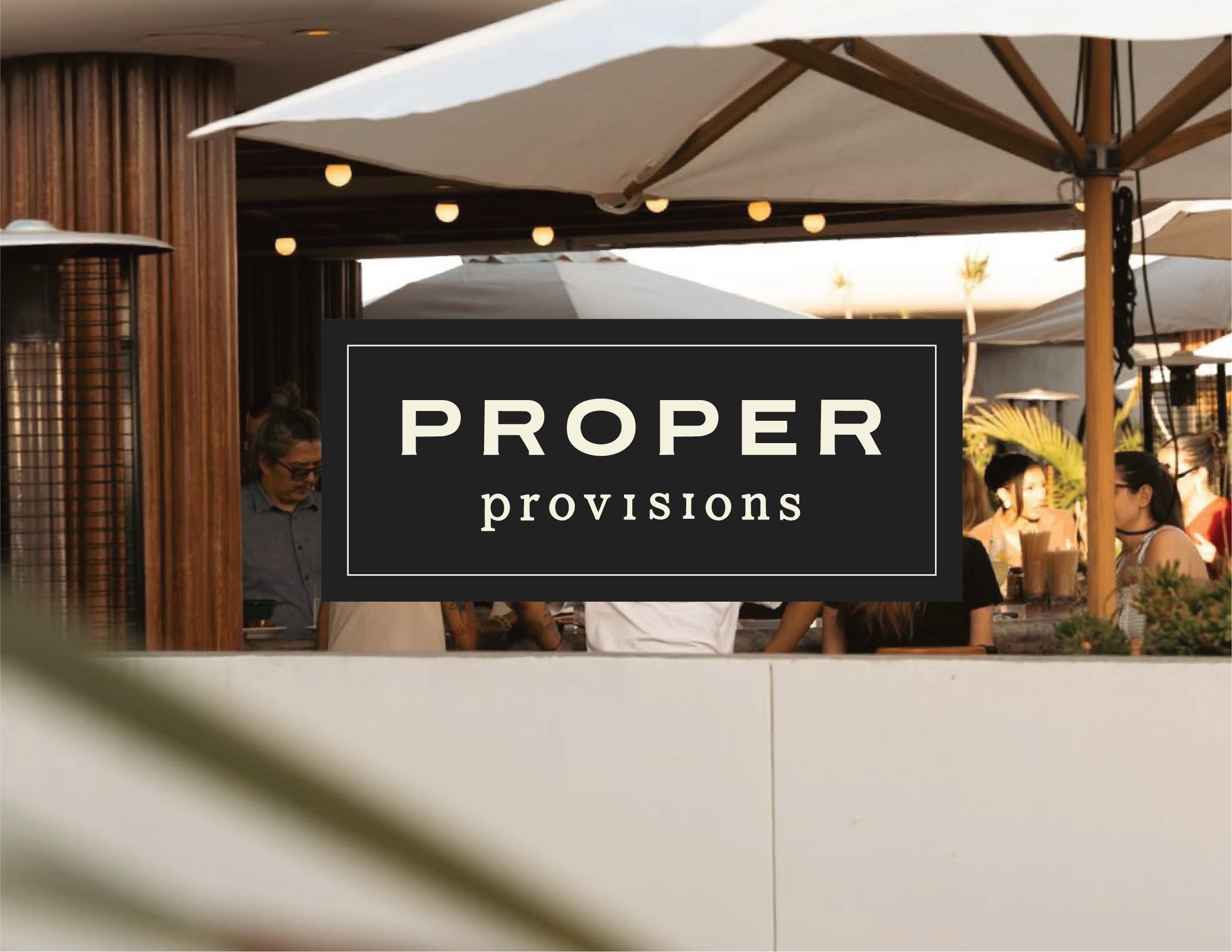
Proper Provisions
Brand Identity, Art & Creative Direction, Packaging Design & Photography
Strategy, Identity and Art Direction: Hailey Caress
Prototyping and Fabrication: Hailey Kim
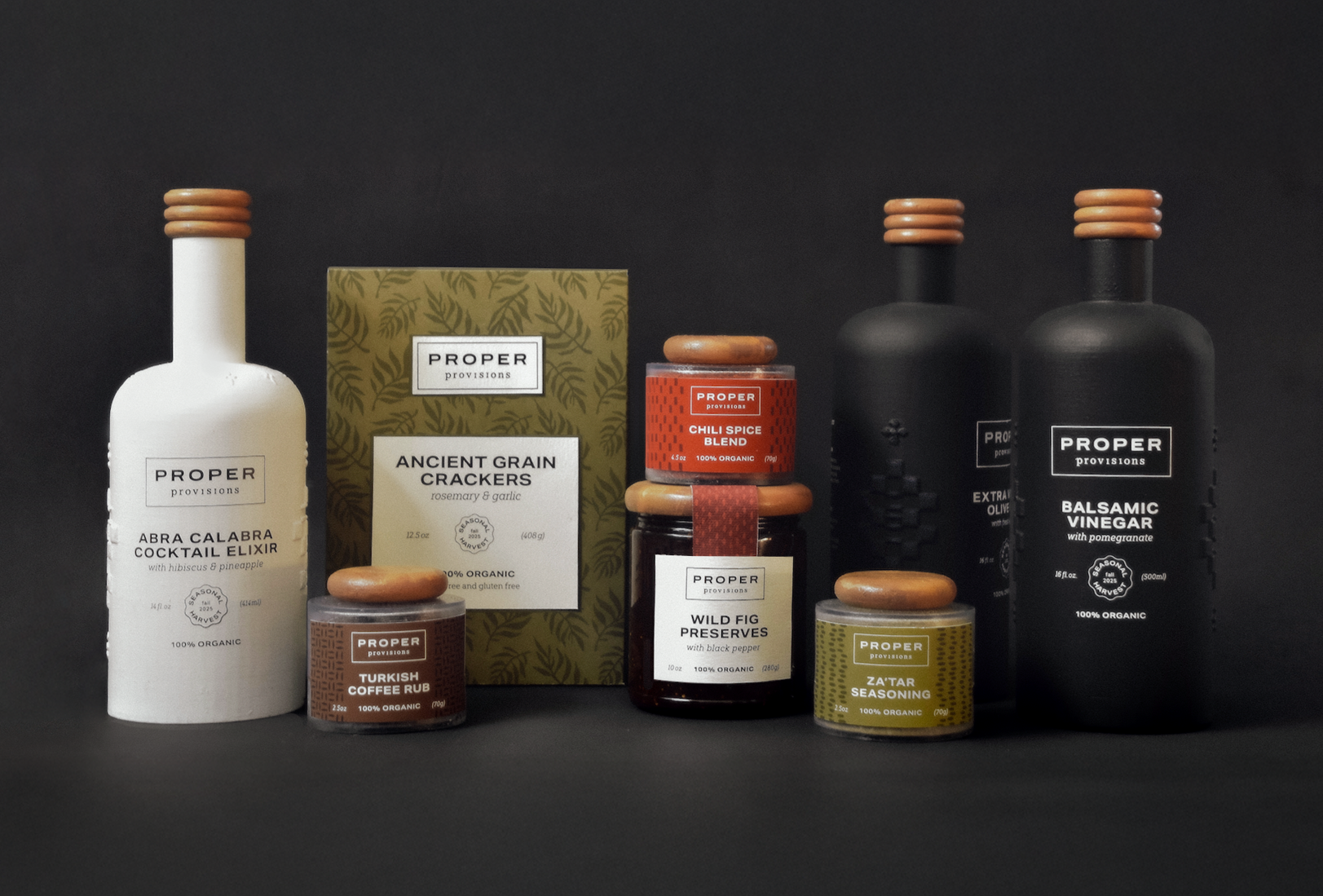
Proper Provisions is a conceptual pantry product line created for Proper Hotels, designed to extend the brand’s ethos beyond the boundaries of the hotel stay. Rooted in the richness of California’s seasonal harvests, the collection reflects the culinary spirit of Proper’s unique dining experiences. Each product is thoughtfully developed with a focus on wellness, flavor, and sensory richness, drawing from both global influences and locally sourced ingredients.
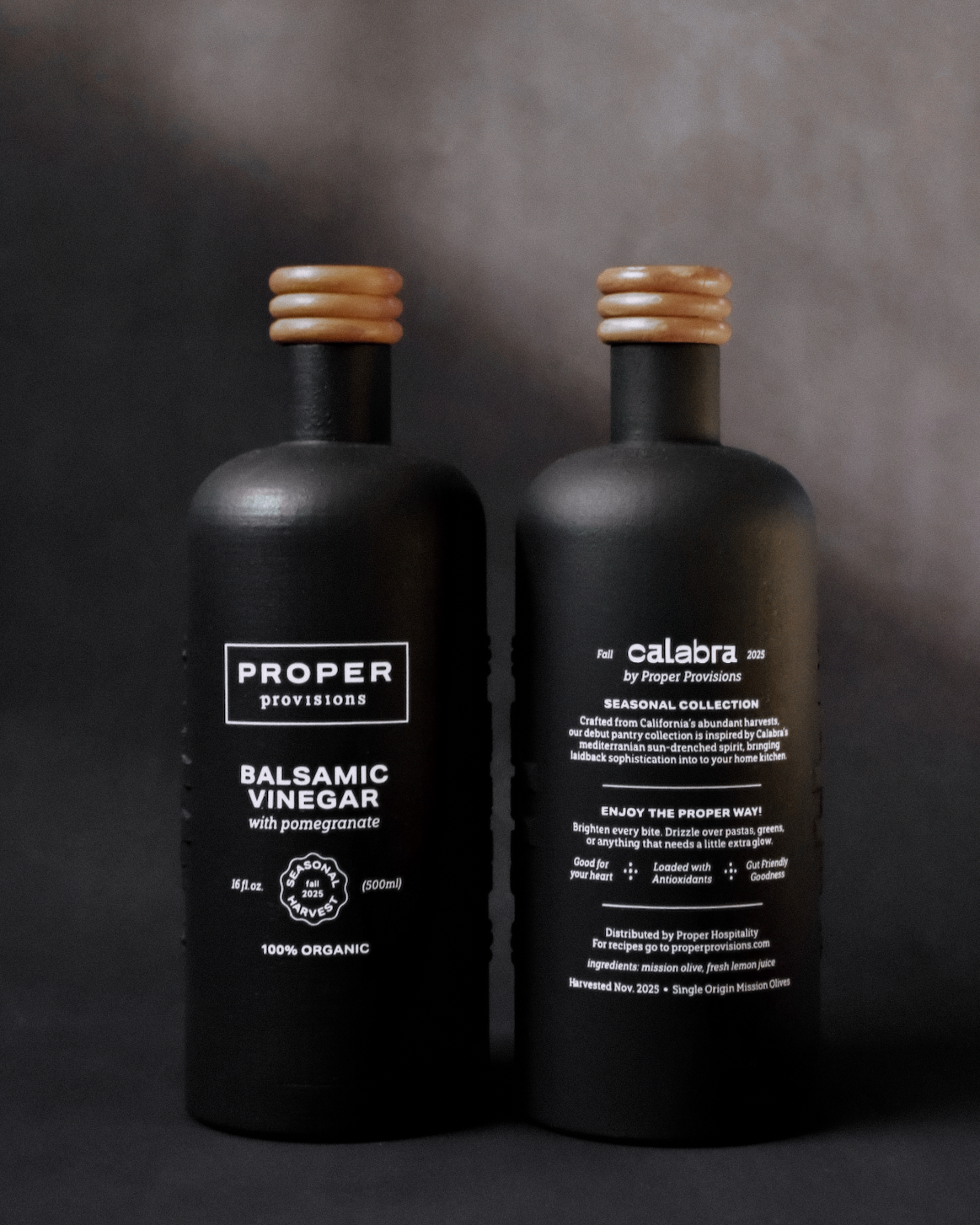
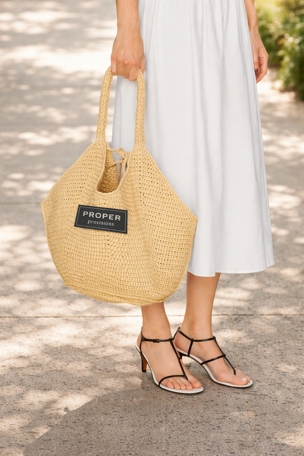
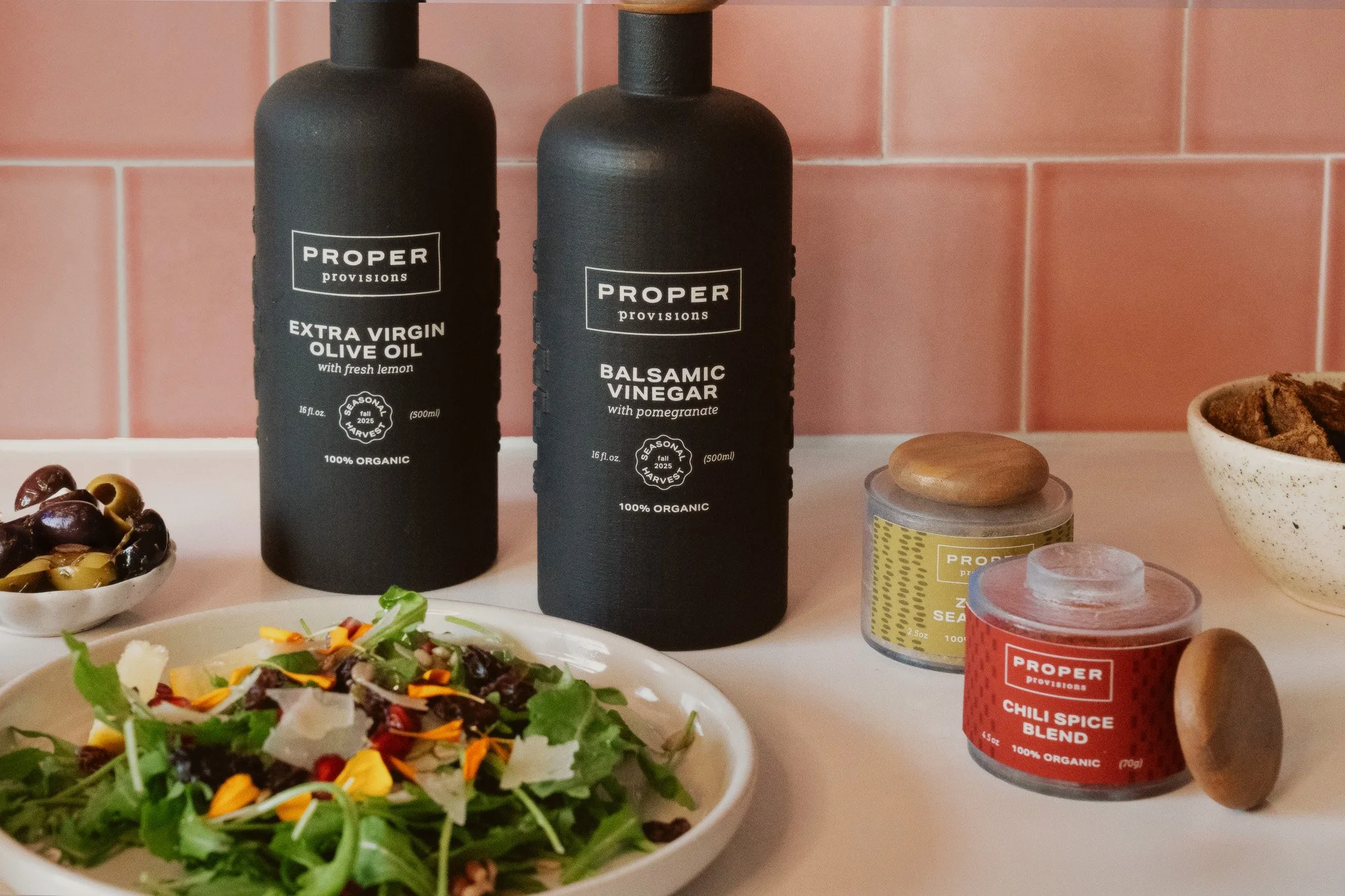
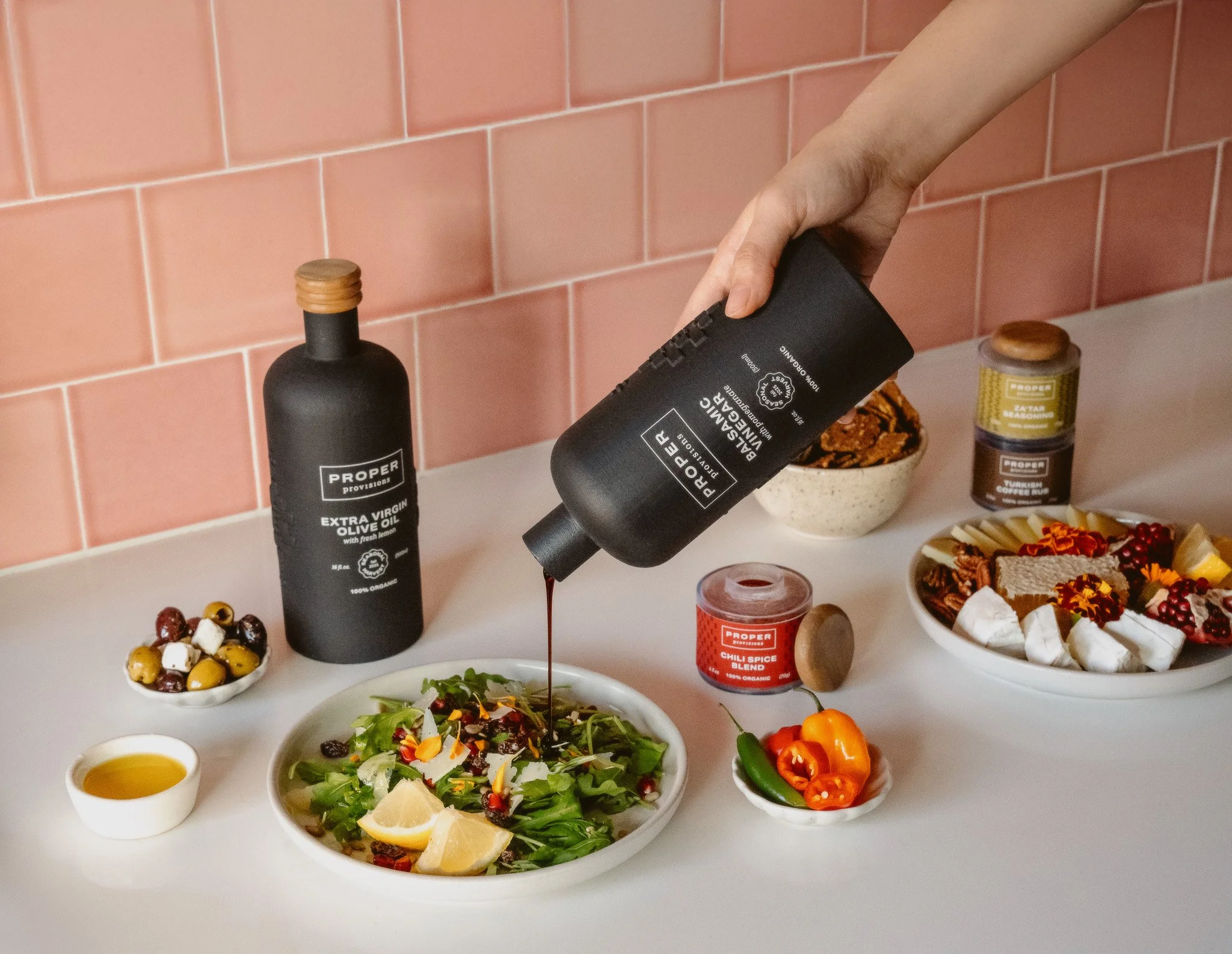
Proper Provisions responds to a growing cultural desire for small, meaningful rituals, and everyday moments that offer comfort, pleasure, and a sense of grounding. In this context, cooking becomes a restorative practice, transforming routine into intention. The packaging system is designed as a collection of objects to be kept, reused, and integrated into the home. Crafted from ceramic, wood, and glass, each piece reflects a commitment to sustainable, thoughtful design.
Aligned with Proper’s ethos of uncommon luxury, the collection brings together elevated design, intuitive wellness, and a deep connection to local culture. Proper Provisions reimagines pantry staples as lasting objects of experience nourishing the mind, body, and spirit long after the stay ends.
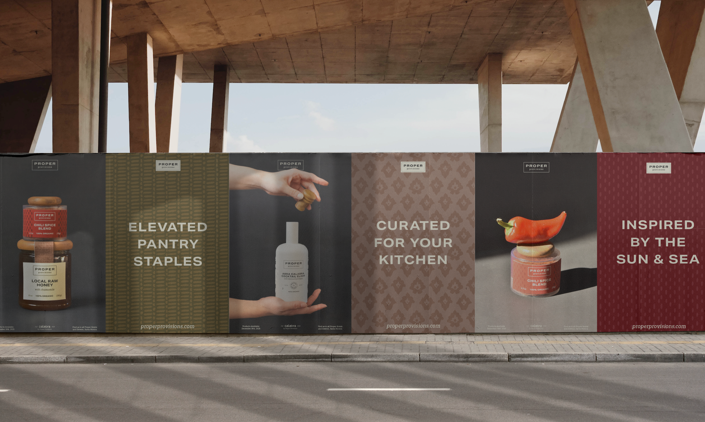
BRAND EVOLUTION
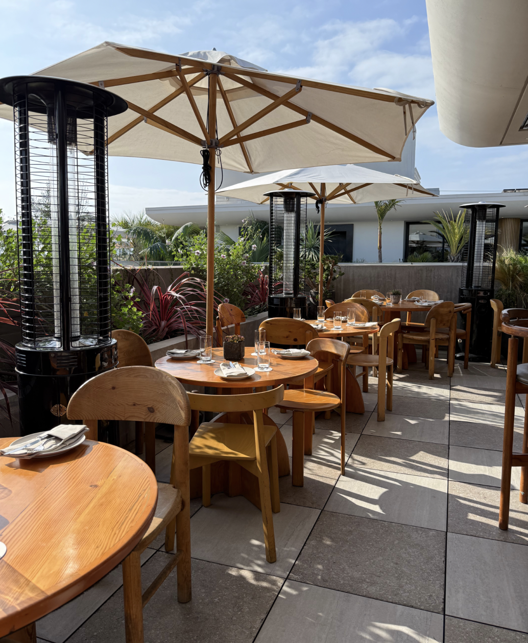
The Proper Hotel’s eclectic, layered, and approachable luxury sets it apart from competitors. Each of the locations feels genuinely rooted to the city, through design, food, and wellness. The brand skews very high-end, with few everyday touchpoints beyond the stay. More accessible take-home products, sold at the hotel and in select luxury grocers can bring comfort, warmth, and ongoing connection to the Proper experience.
PRODUCT LINE CONCEPT
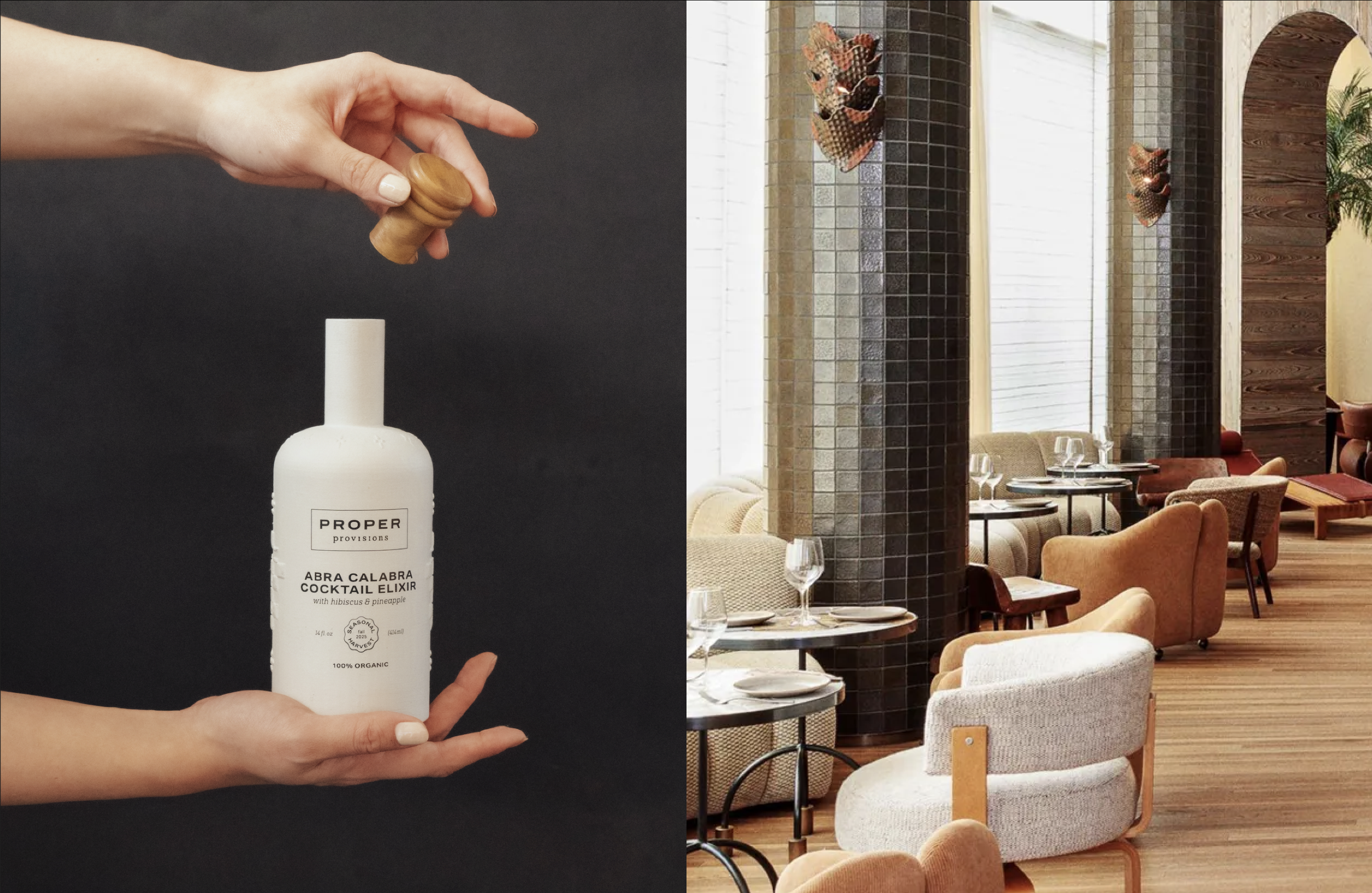
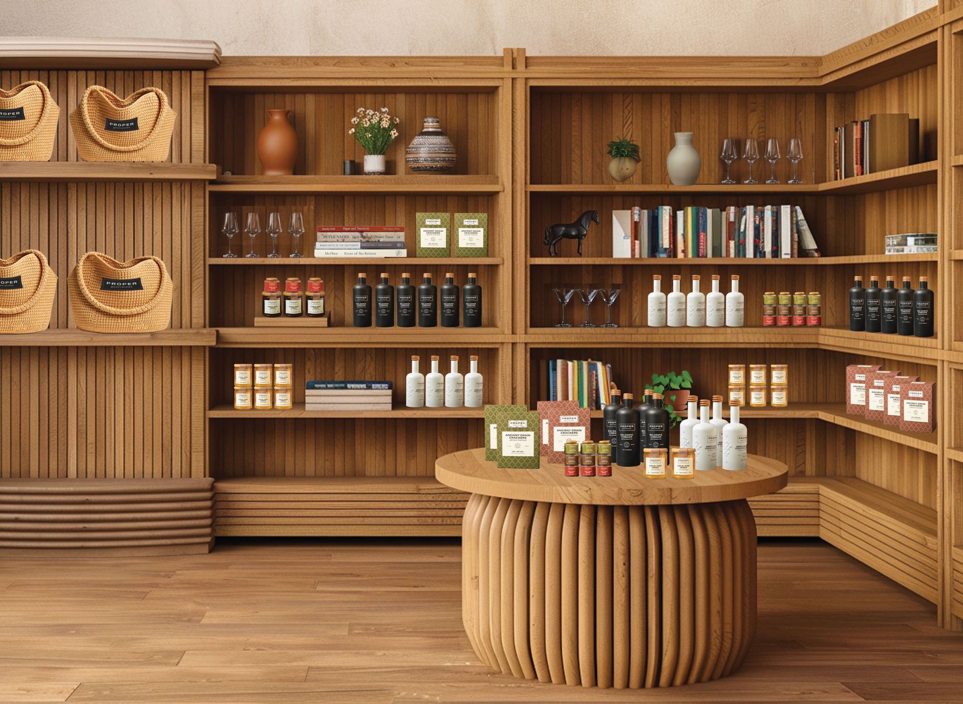
Our first collection begins with Calabra, the coastal-Mediterranean restaurant that embodies the vibrancy of Santa Monica Proper. Together, we’ve distilled their signature style into a line of elevated essentials. Future releases will bring new collaborations from across the Proper family, each offering its own culinary perspective to expand the range of sophisticated flavors, seasonal ingredients, and chef-guided creativity you can enjoy at home.
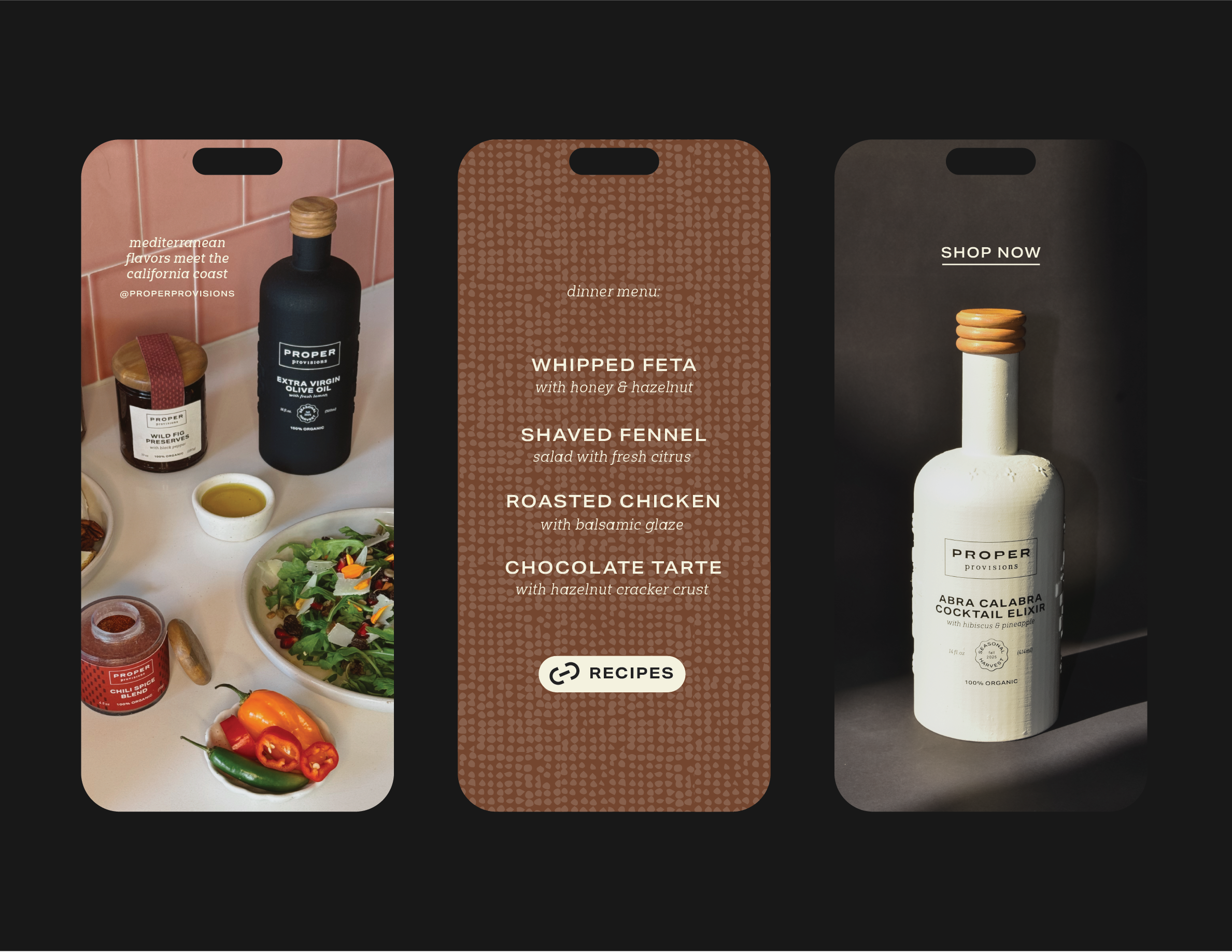
Intentionally selected, pantry staples, to bring a taste of the Proper ethos into your home kitchen.
ART DIRECTION
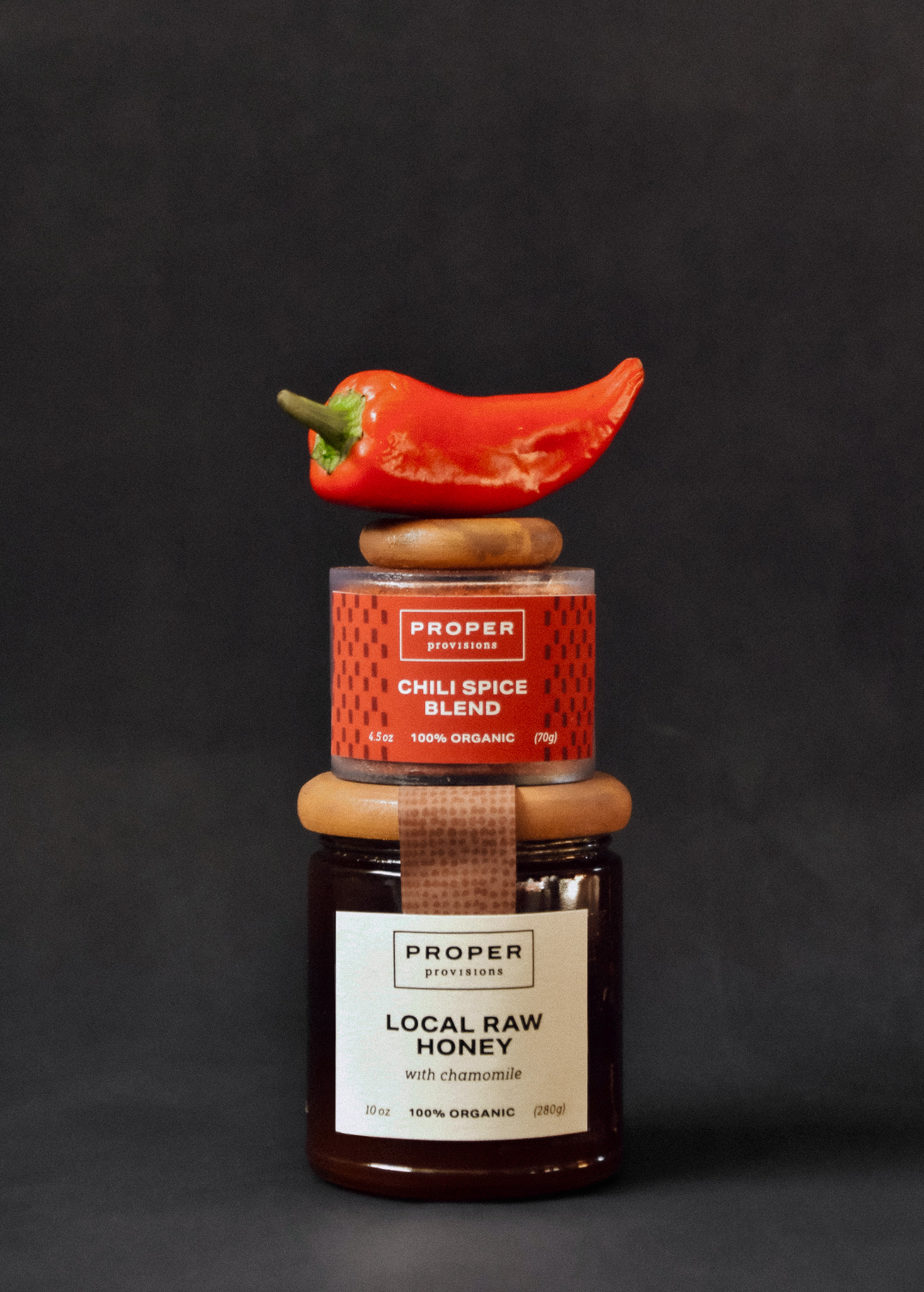
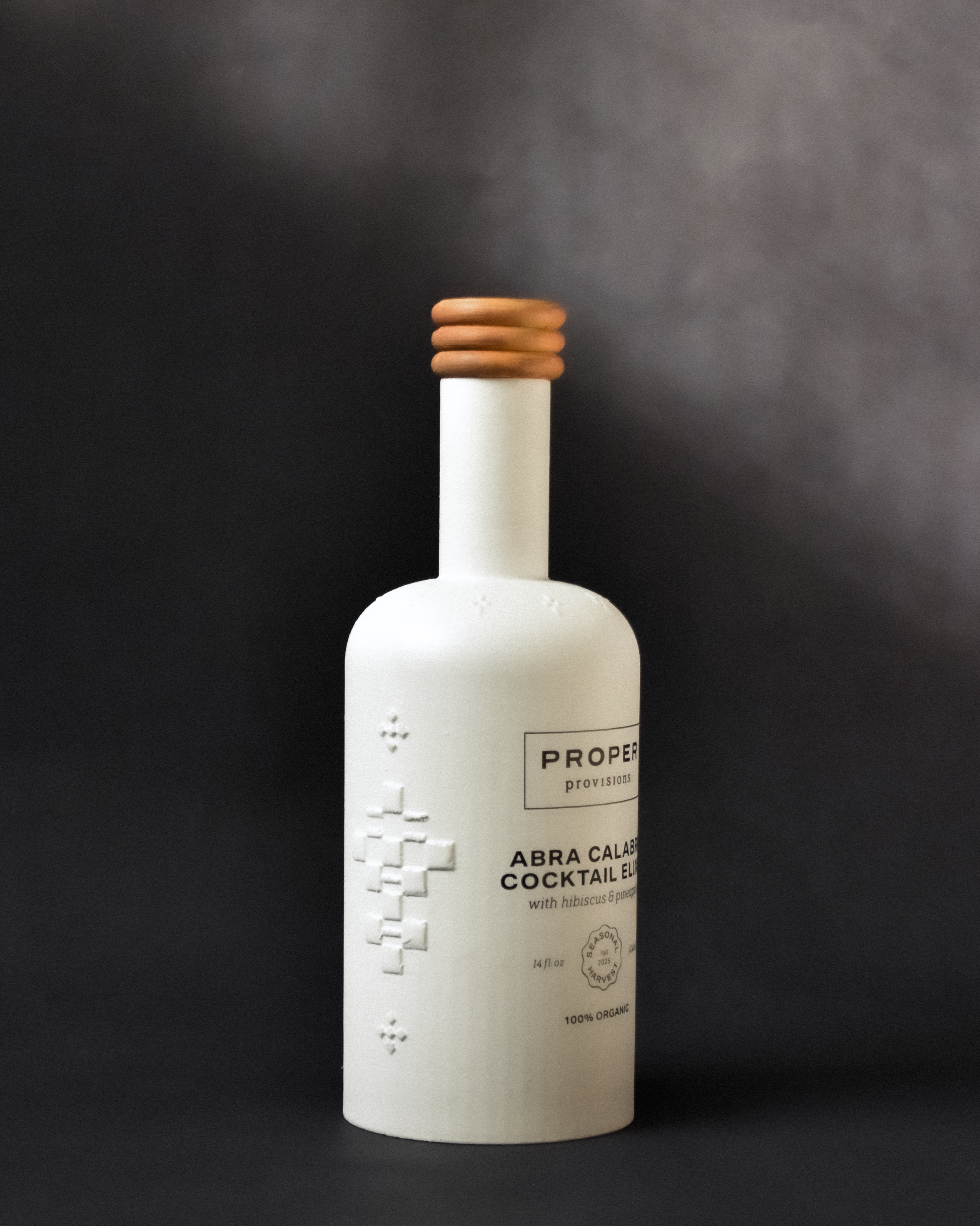
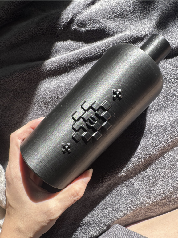
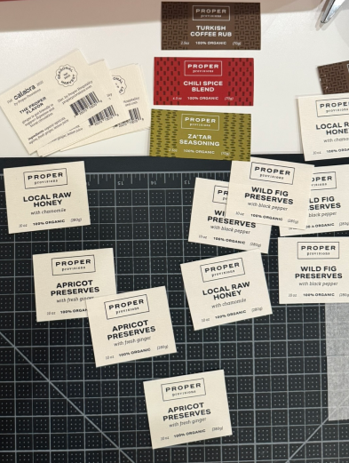
The art direction for Proper Provisions draws directly from the interior design and architecture of Proper Hotel. The packaging is inspired by the materials, textures, and details found throughout the space, like warm wood, soft textiles, natural light, and refined forms. These influences translate into tactile design decisions: embossed ceramic bottles, custom wooden caps, canvas fabric seals, and natural fiber paper. Each element reflects the same attention to detail found within the hotel environment, creating a sense of cohesion between space and object.
PRODUCTION
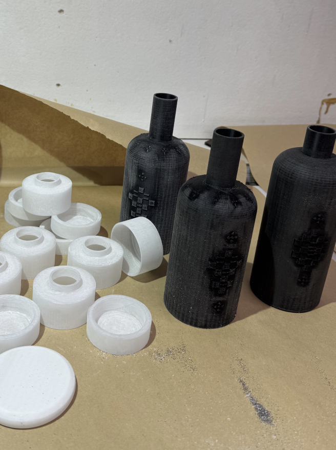
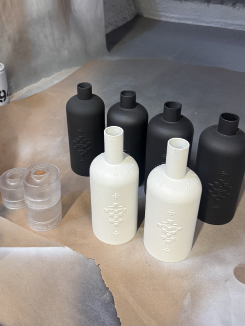
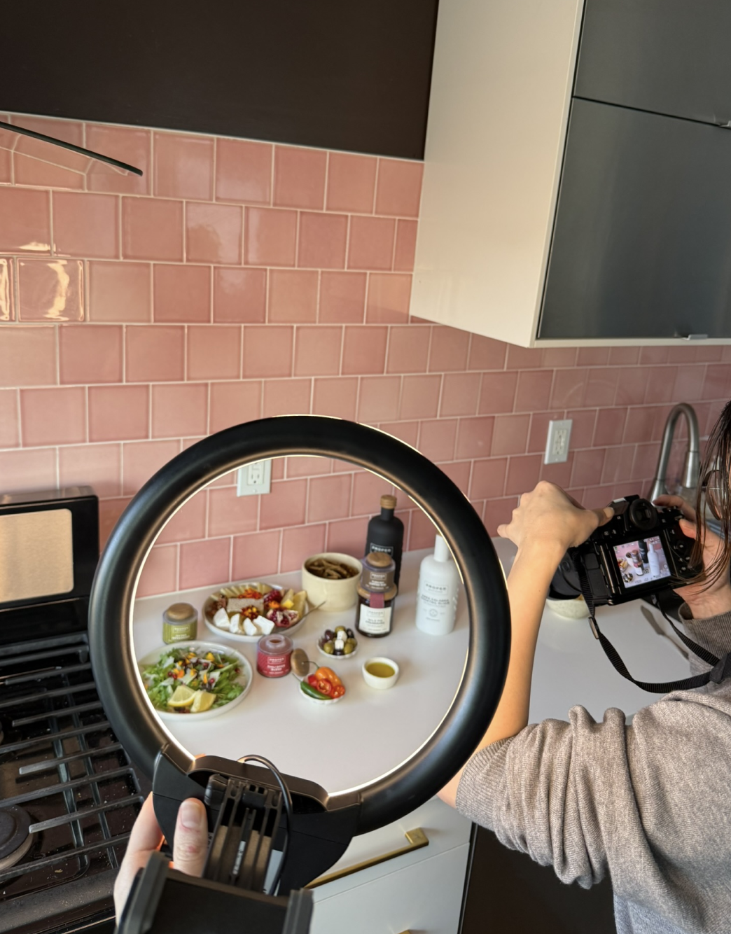
Our prototypes were developed through a hands-on, material-driven process. Each bottle, spice container, and custom cap was 3D printed to establish consistent form, proportion, and structure across the system. Each piece was then hand-sanded and painted to replicate the look and texture of matte ceramic, while the caps were finished to evoke the warmth and tactility of natural wood. The final products were styled and staged for both product and lifestyle photography, creating a cohesive visual system that extends across digital, physical, and social applications.
Sophisticated, Unconventional, Expressive, Bold, Ritualistic
The Art of Living Well