Bluebell
Dieline Awards, 1st Place Concept, 2026
ADC Young Ones, Merit Award, 2025
Brand Identity, Art & Creative Direction, Packaging Design & Photography
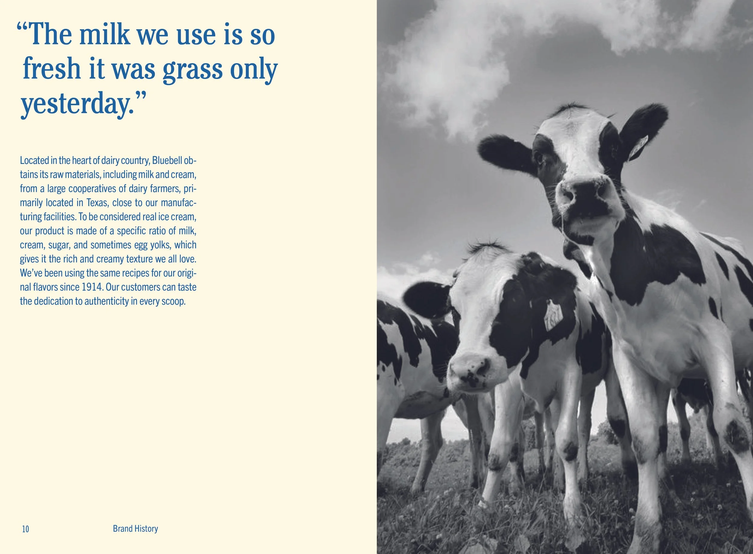
Blue Bell Creameries, founded in 1914 in Brenham, Texas, is a beloved ice cream brand deeply rooted in Southern tradition. The challenge was preserving its cherished heritage while introducing a visual identity that aligns with modern tastes. My approach blended classic, nostalgic cues with a clean, contemporary sensibility to create an identity that honors Blue Bell’s legacy while resonating with today’s audience. The identity balances heritage and modernity, continuing Blue Bell’s tradition of delivering classic ice cream with a sense of childhood joy.
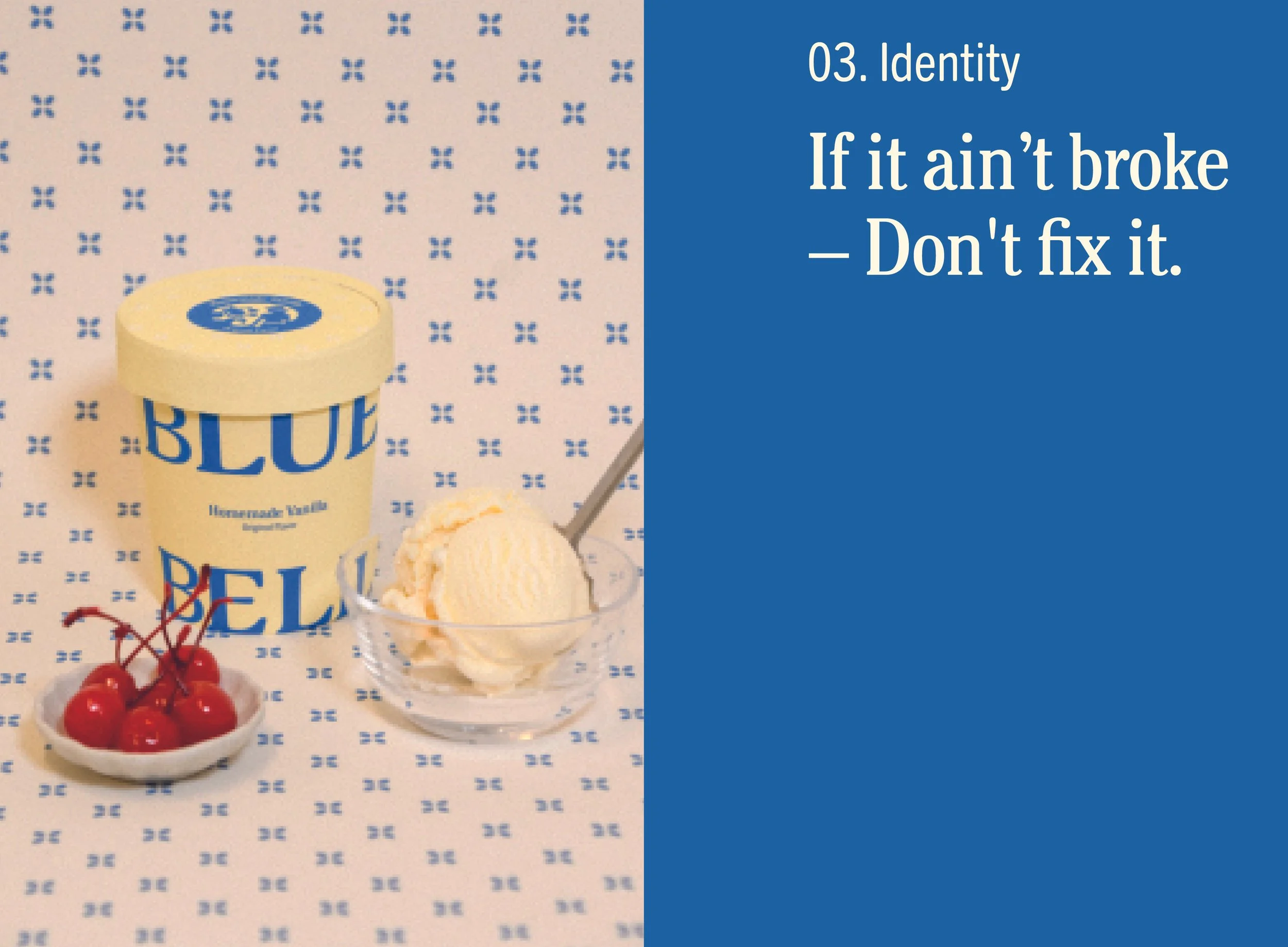
CONCEPT STATEMENT
Capturing the same authenticity and southern charm that has always defined Bluebell, by remaining instantly recognizable, while also reimagining the elements their customers know and love.
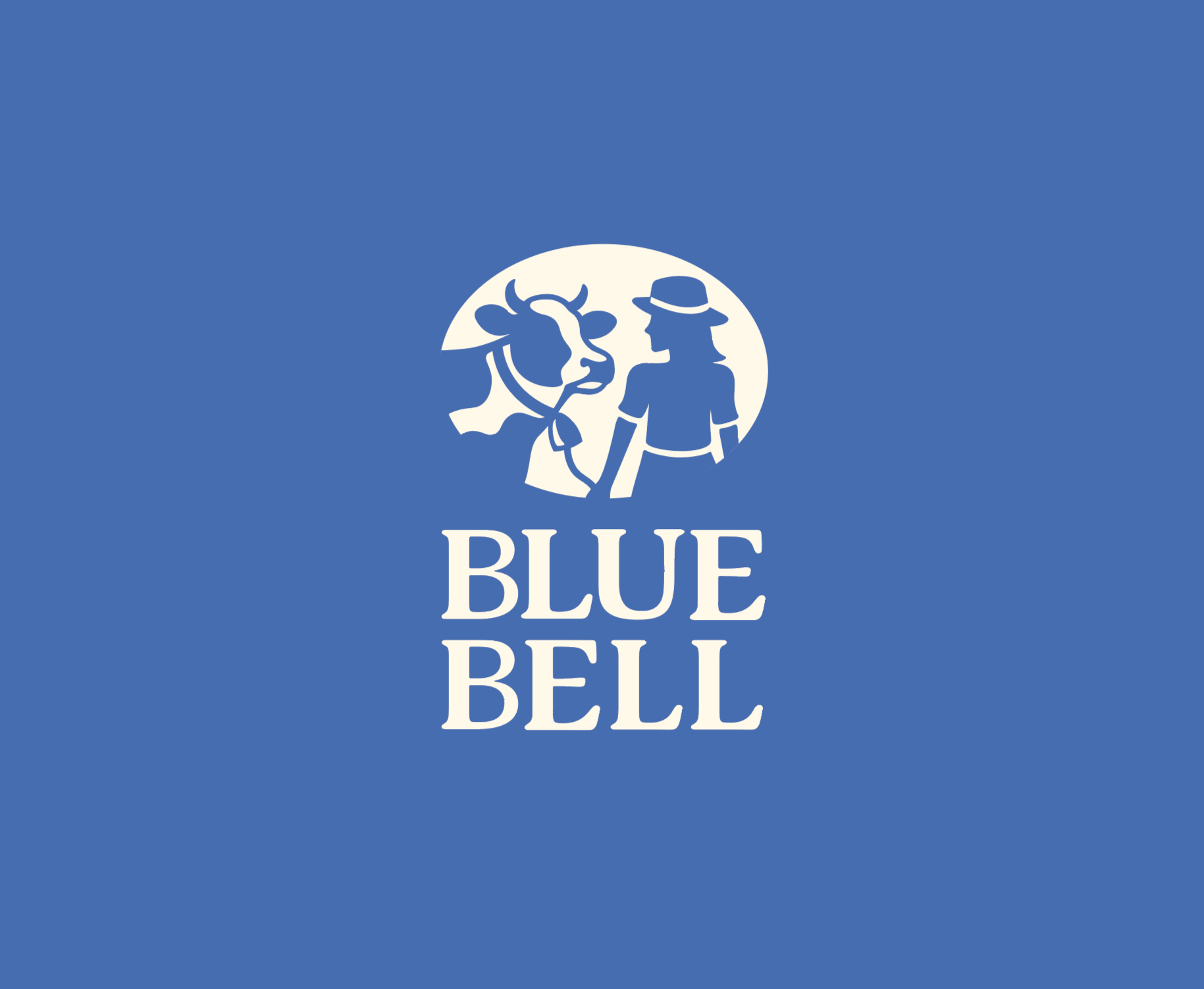


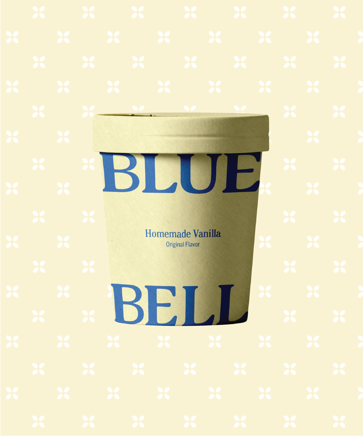
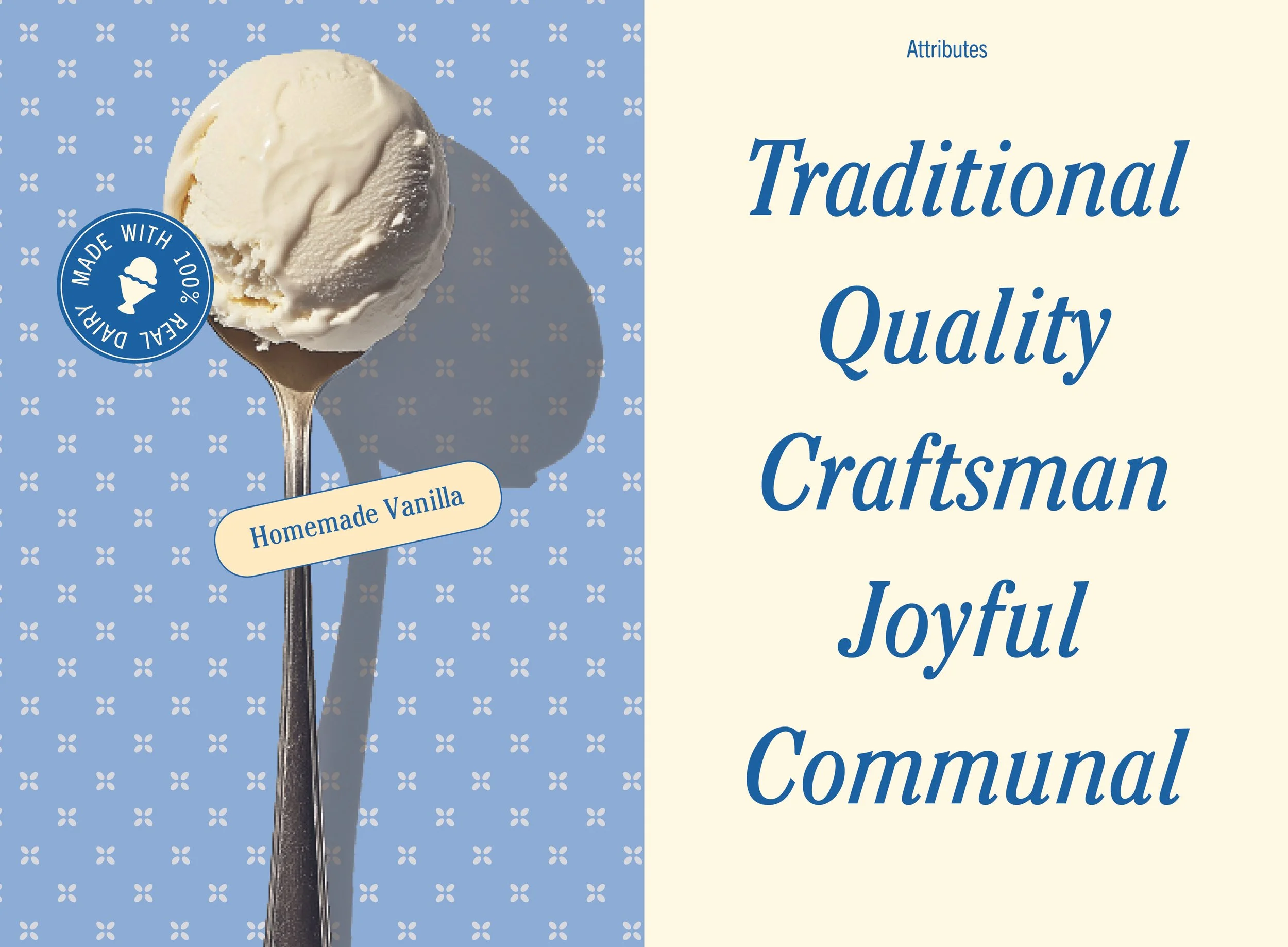
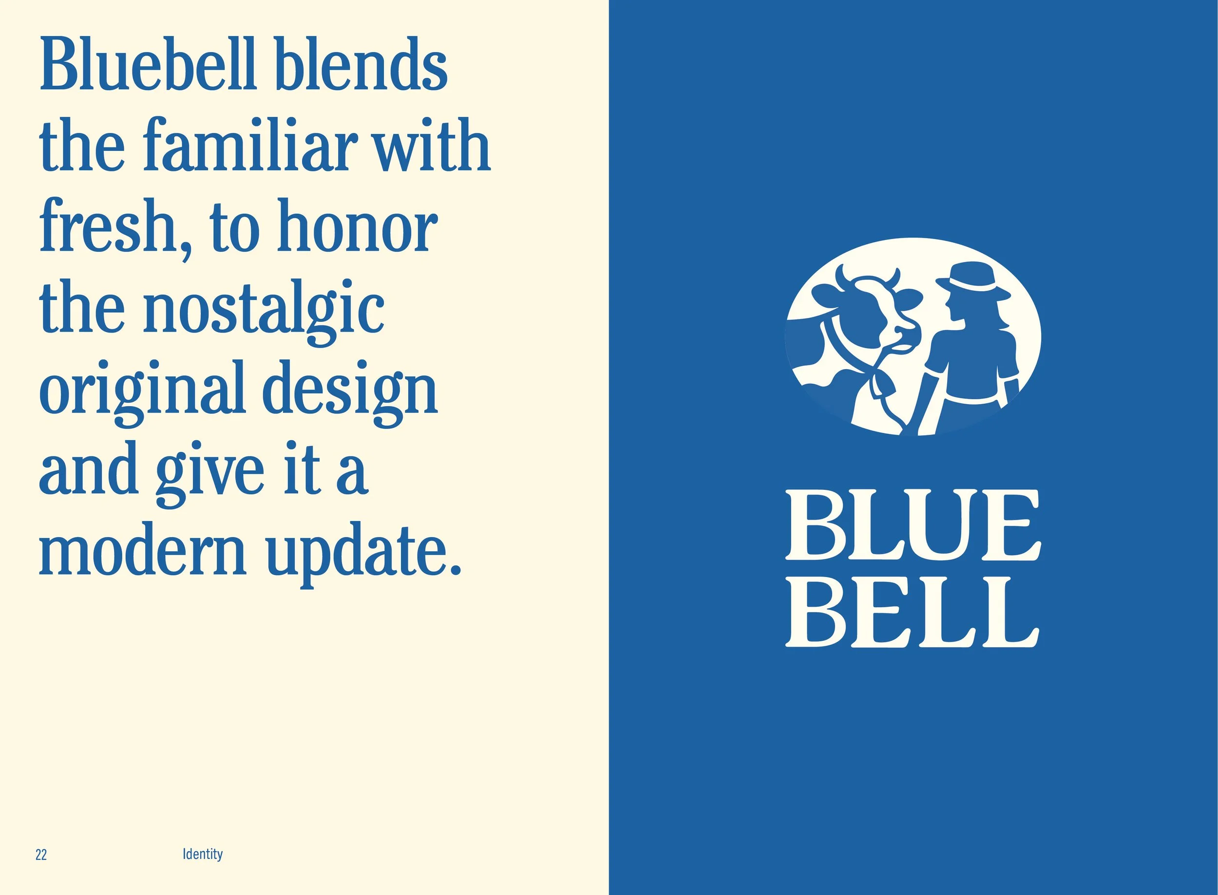
LOGOTYPE & ICON
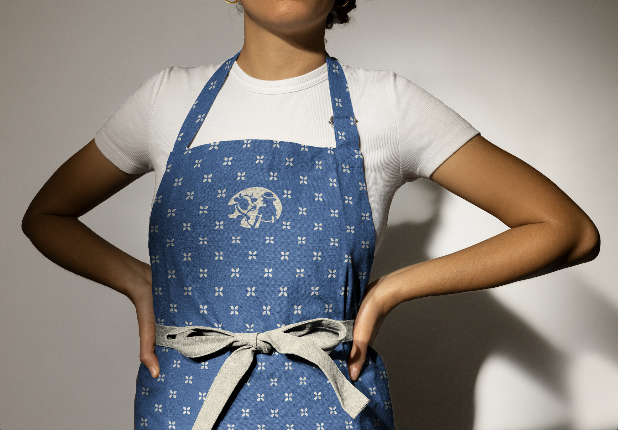
The logotype features a friendly, soft serif with subtle contrasts that reference the charm of traditional American wood type. I reimagined Blue Bell’s iconic illustration of the little girl leading her cow, simplifying it into a refined logo mark that retains key details—her brimmed hat and the cow’s bell. The two figures face each other, symbolizing a lasting bond and serving as a tribute to Blue Bell’s heritage.
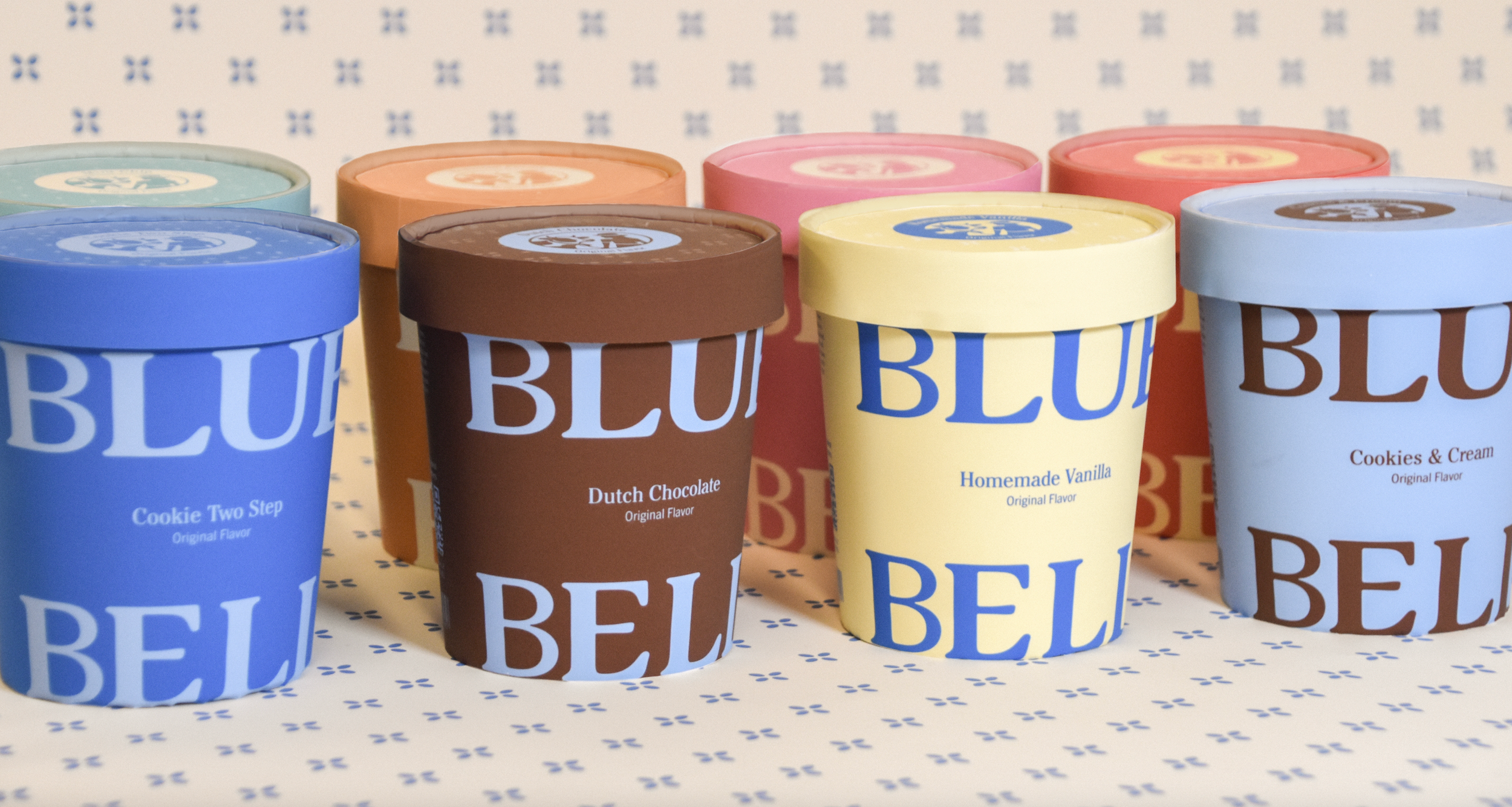
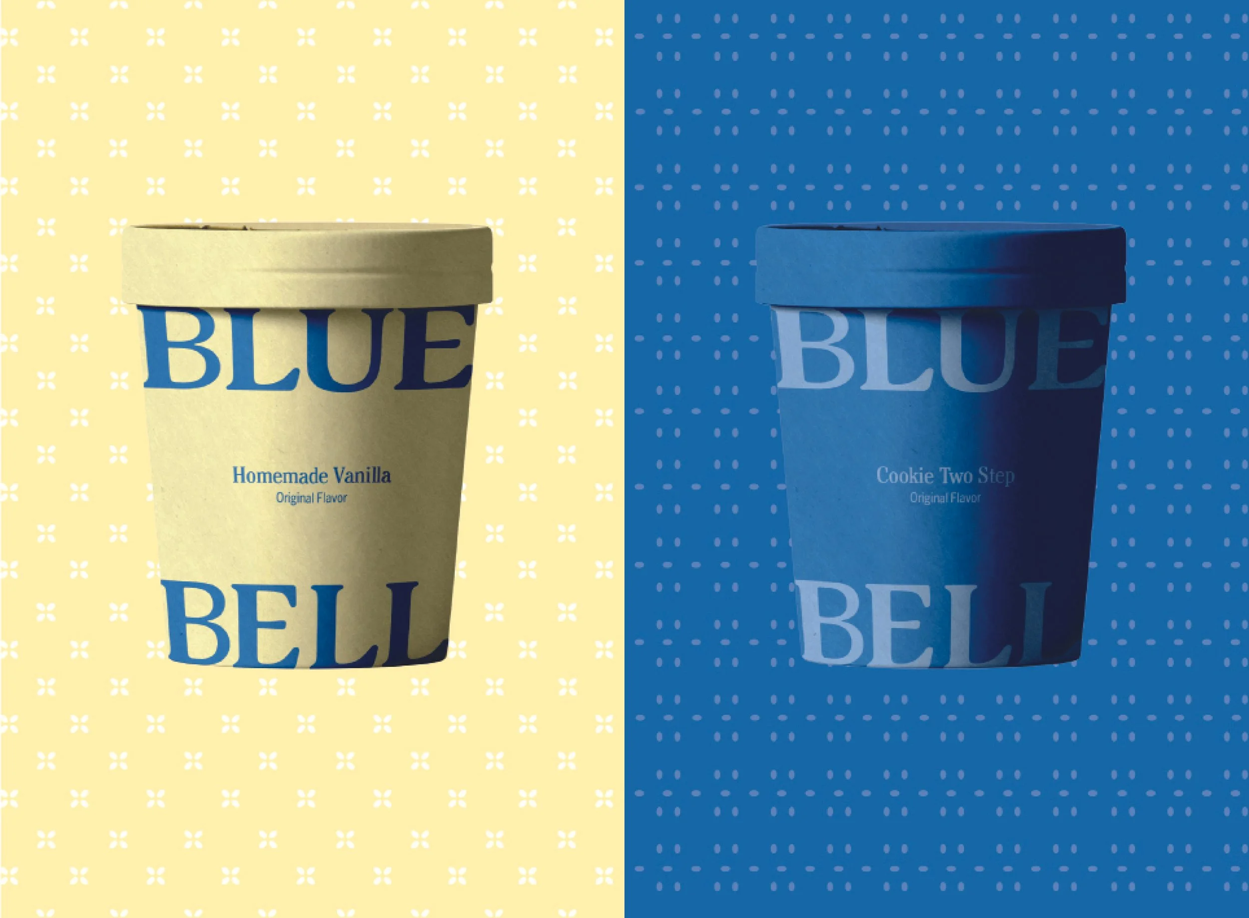
VISUAL IDENTITY
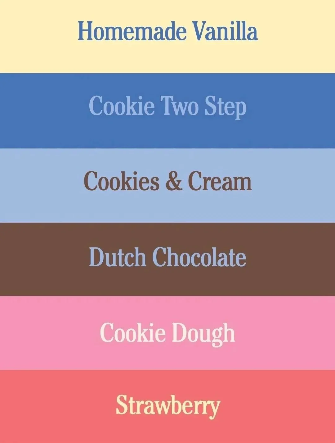
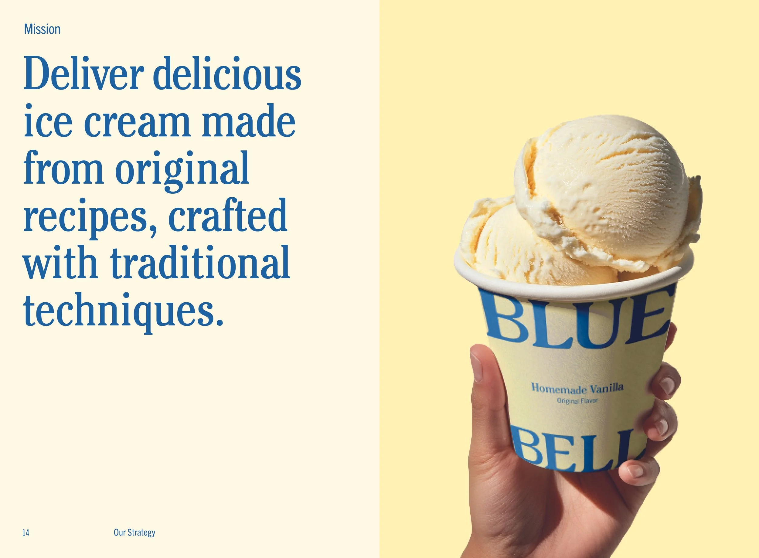
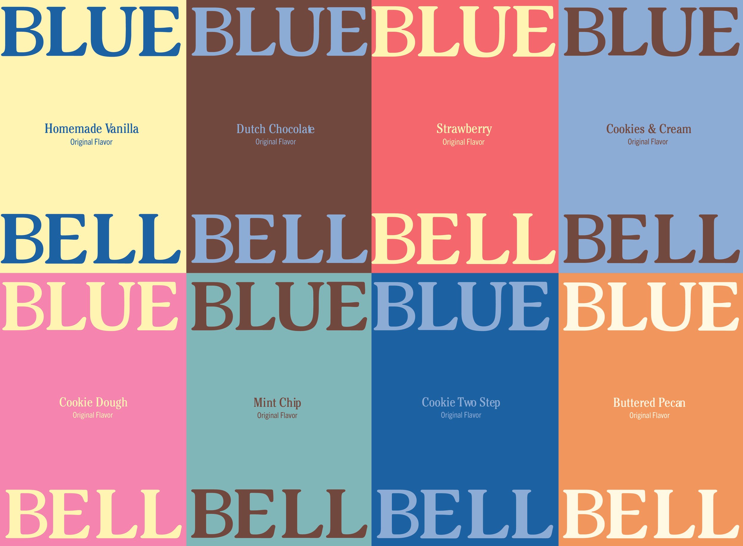
Vibrant cobalt blue serves as the primary brand color, paired with a retro-inspired secondary palette. I drew inspiration from stitchwork and quilt making to create a collection of textile-inspired patterns for each of Blue Bell’s original flavors, offering a modern interpretation of handcrafted familiarity. The typeface pairing of Cheltenham and Trade Gothic was chosen to reflect the brand’s Southern spirit.
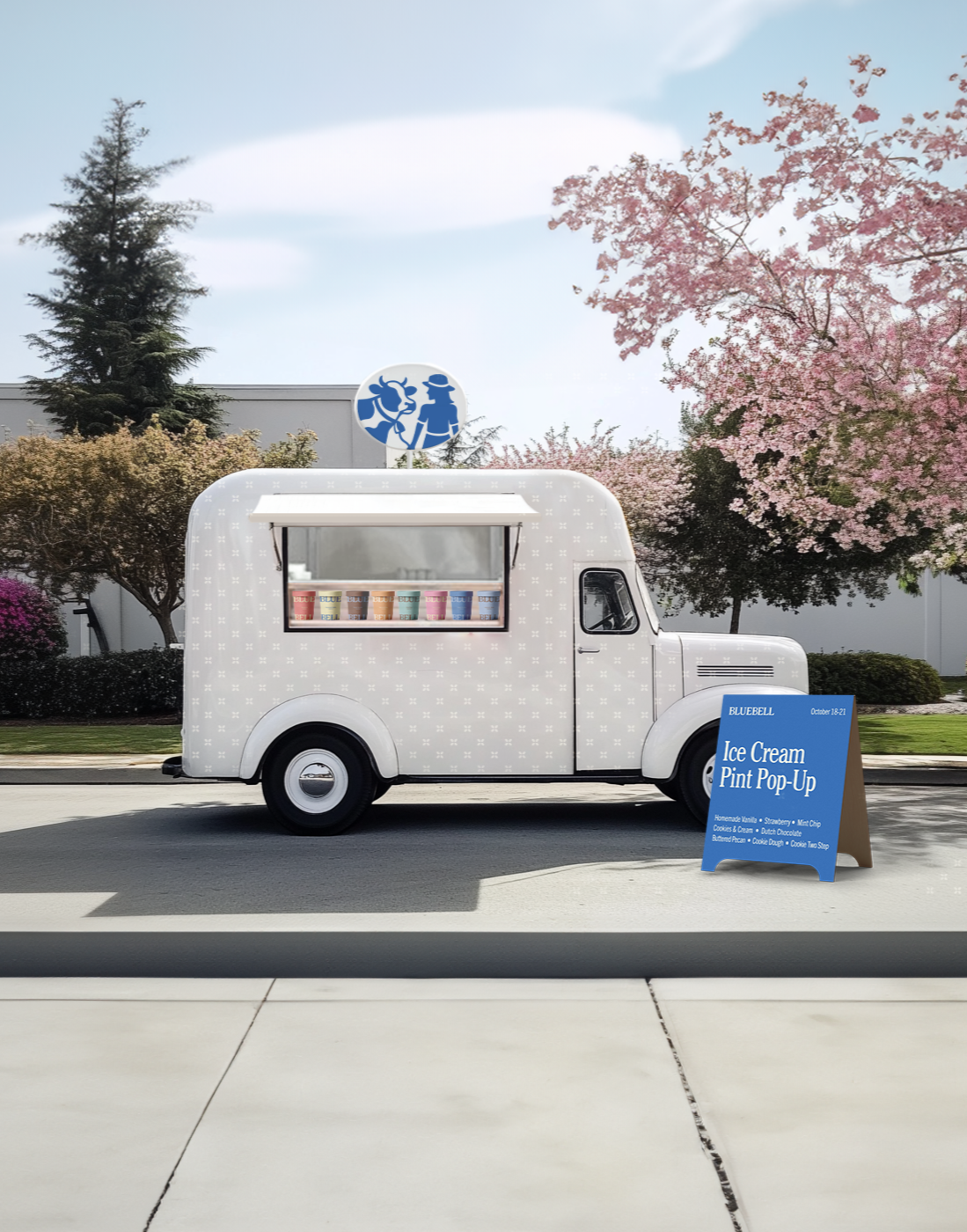
TRENDS & OPPORTUNITIES
There is an opportunity to reach younger audiences and celebrate Blue Bell’s legacy by hosting pop-up ice cream trucks in local communities. Using recyclable or compostable packaging at these pop-ups and in direct-to-consumer sales would align with today’s consumer values and reinforce the brand’s commitment to staying current.
TARGET AUDIENCE
The target audience spans older generations who value tradition and brand loyalty, as well as younger generations seeking comfort in fresh yet familiar brands. Across all ages, our audience appreciates authenticity, enjoys a sense of nostalgia, and loves full-dairy ice cream products.


BRAND BIBLE
The Brand Bible captures Blue Bell’s visual language, tone, and spirit. It defines a nostalgic voice that is familiar, like a Southern grandmother’s charm, while outlining the visual elements that guide the creative and art direction.
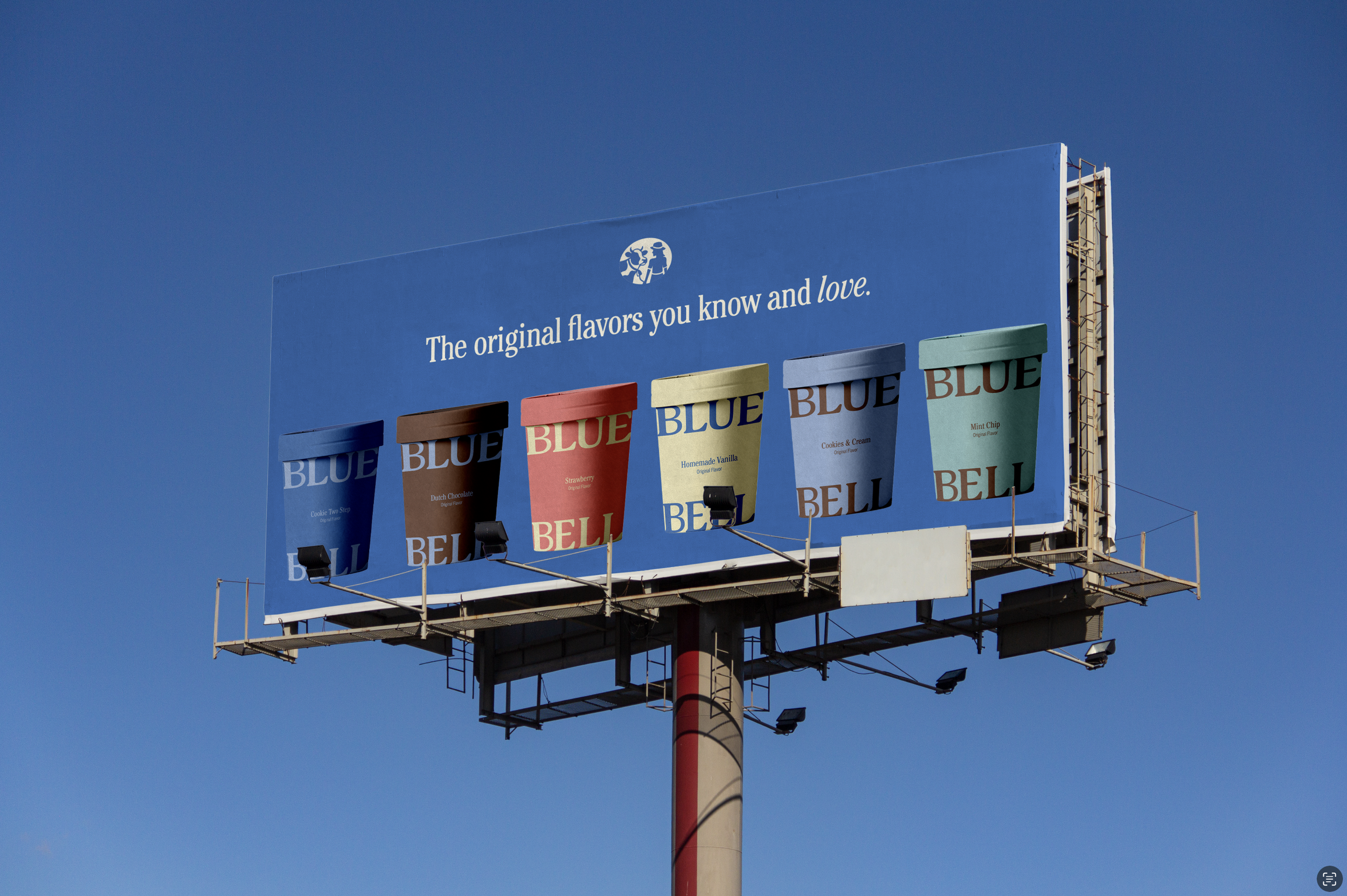
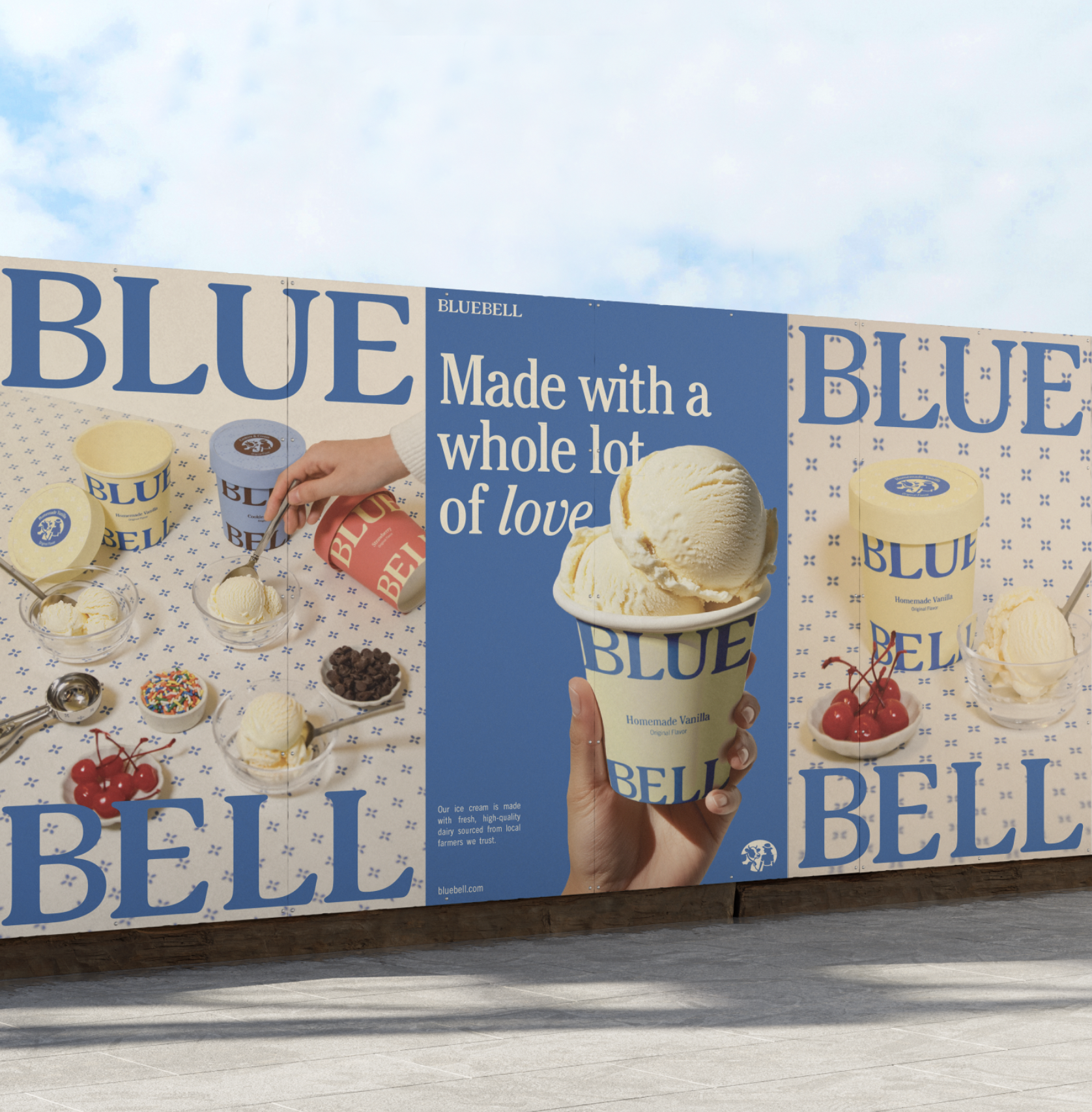
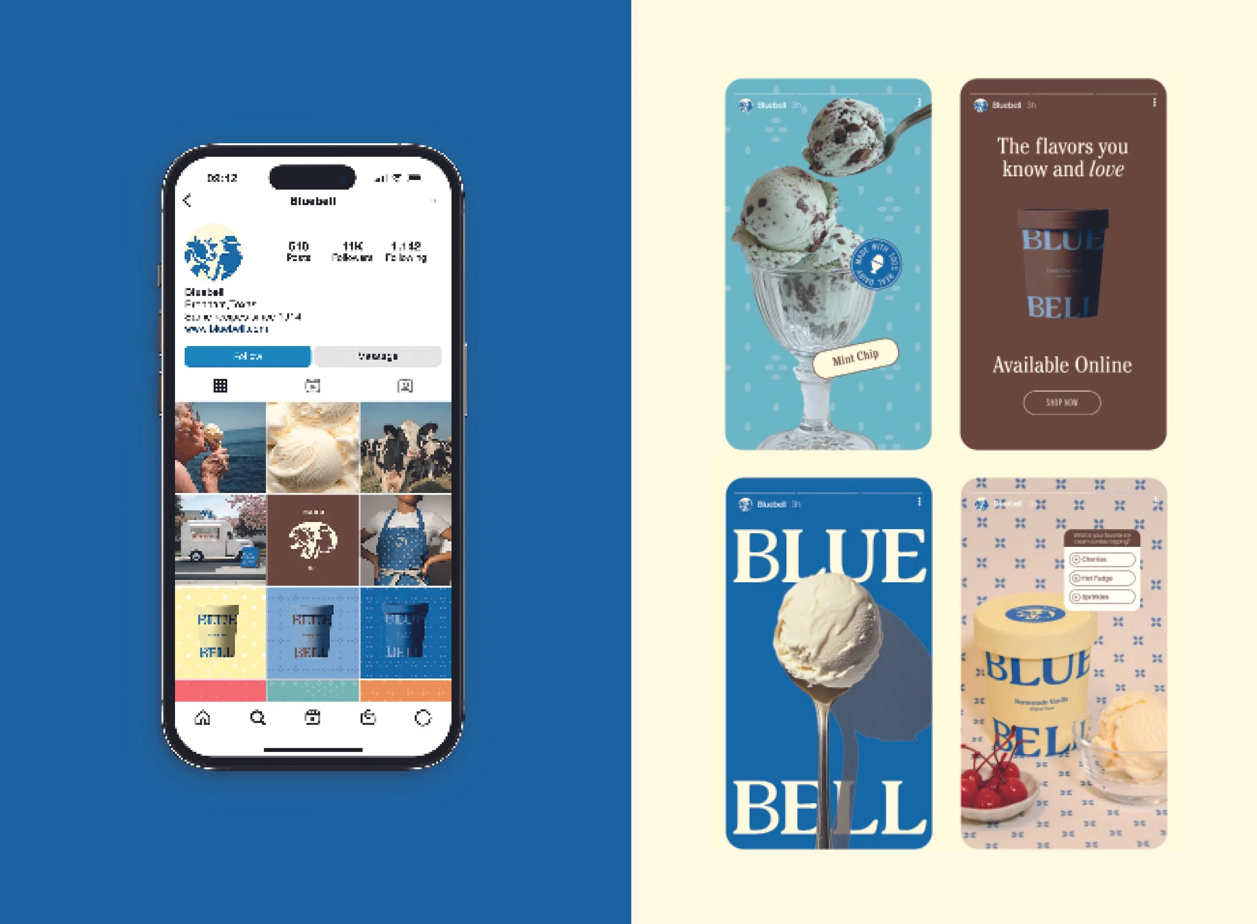
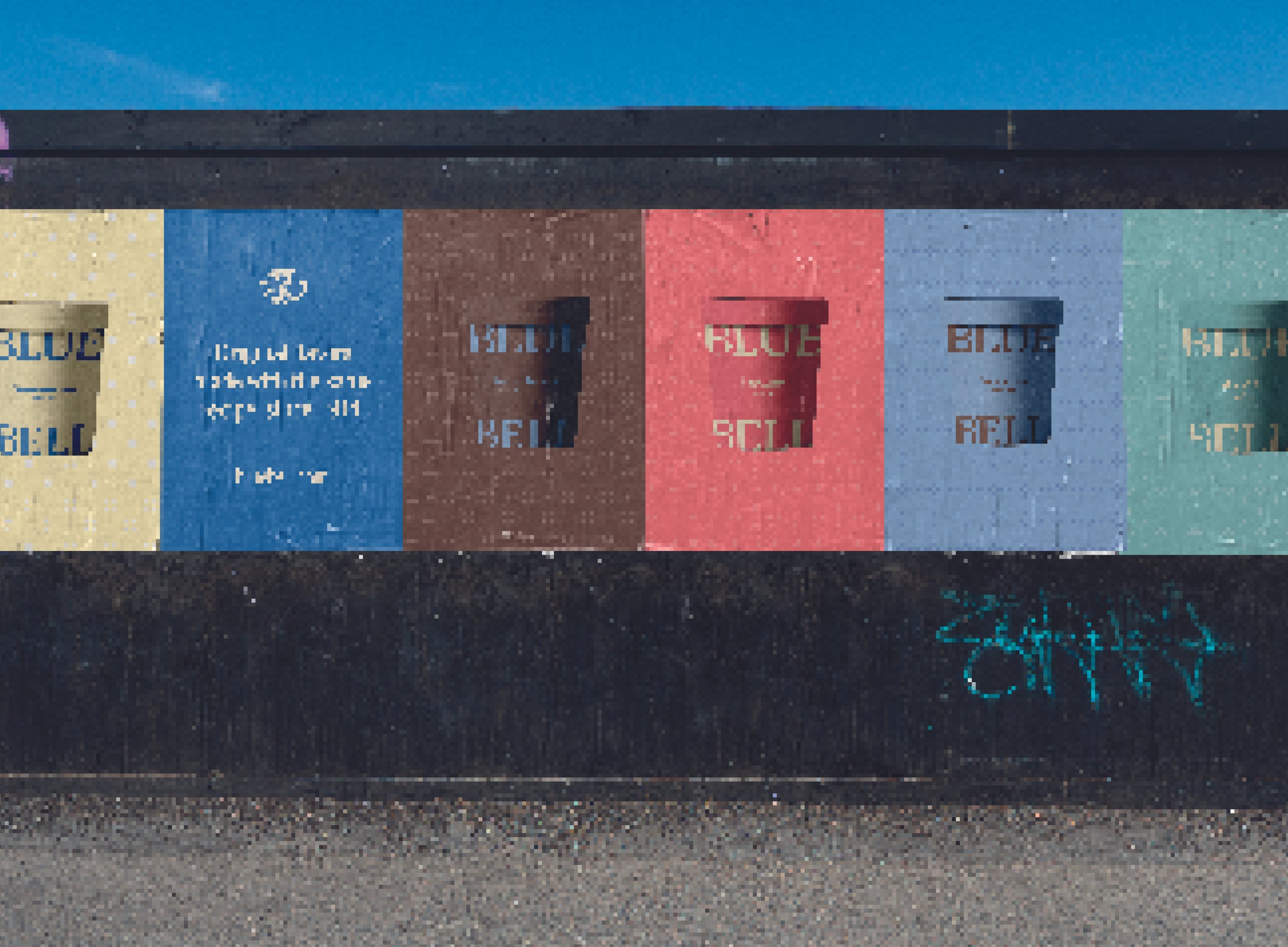
OUT-OF-HOME ACTIVATION
The out-of-home advertisements and social media are designed to capture attention at a glance. Bold, colorful, and full of personality, to highlight the variety of flavors and create a cohesive story across every touchpoint.

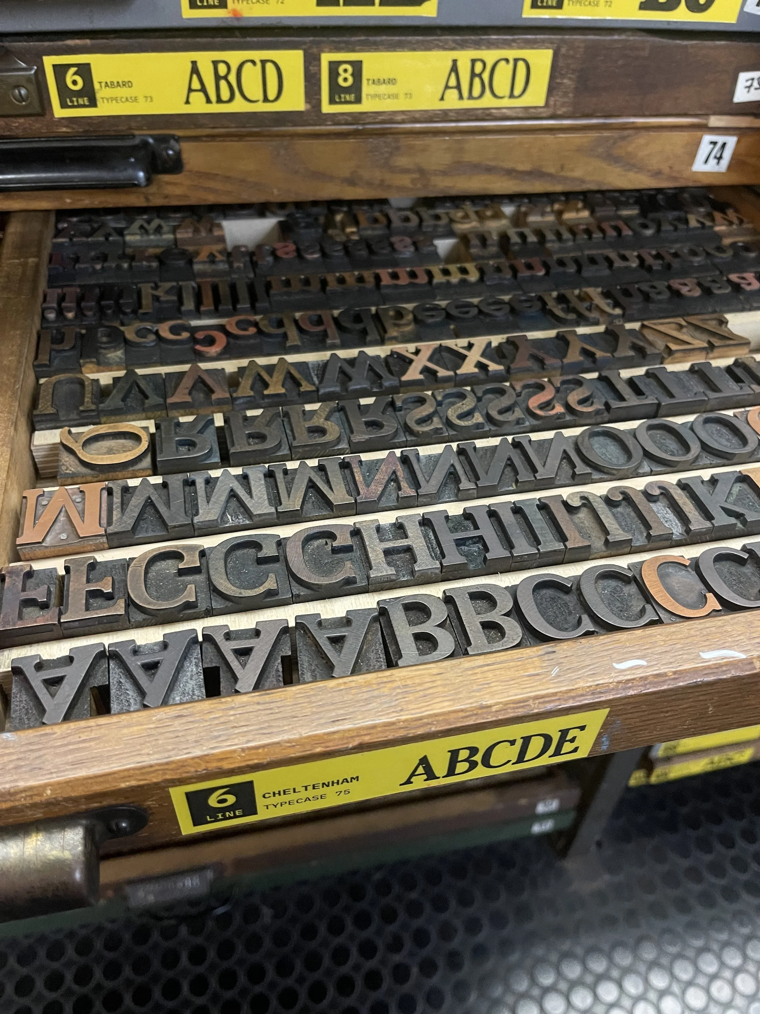
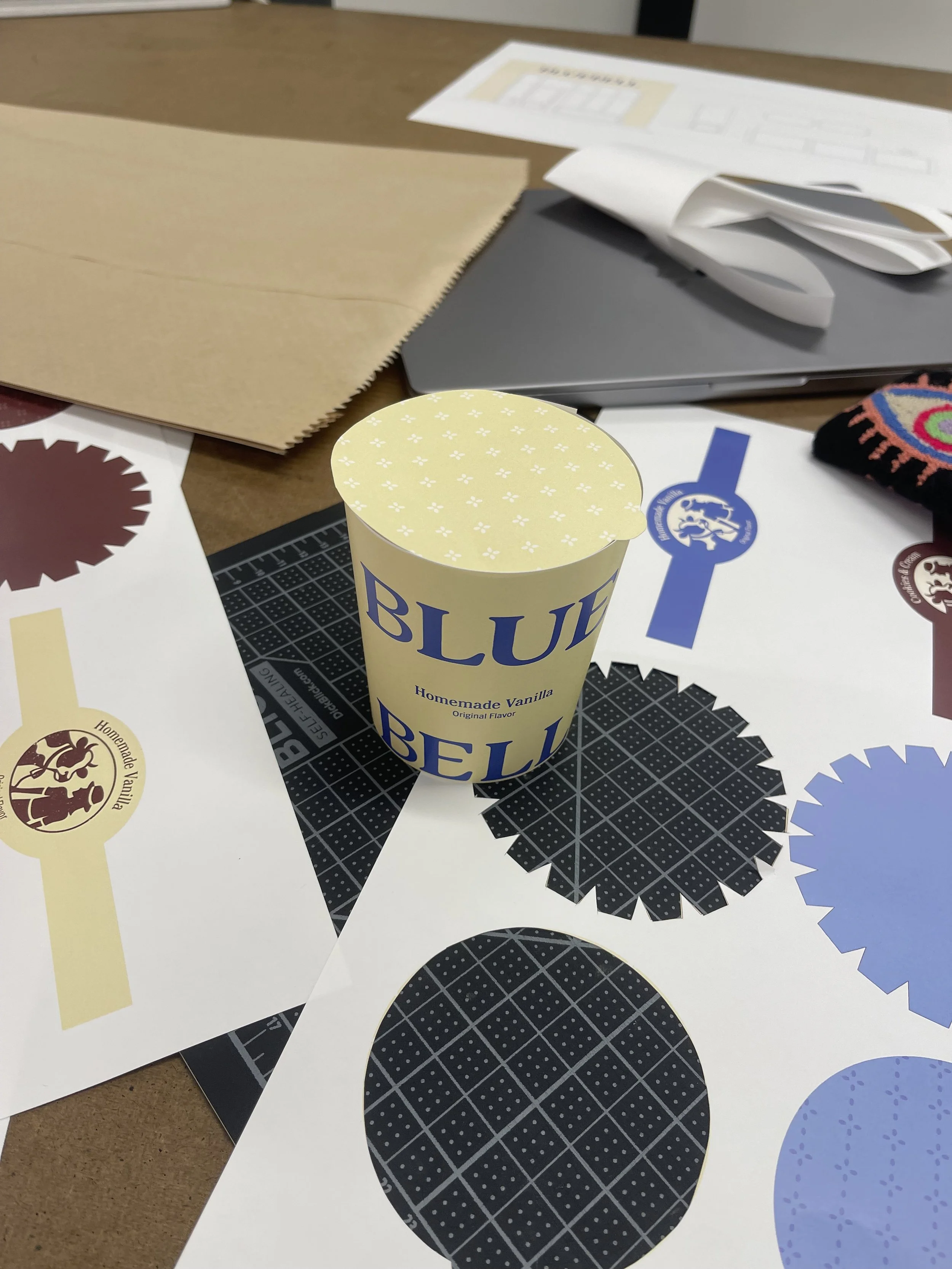
PROCESS
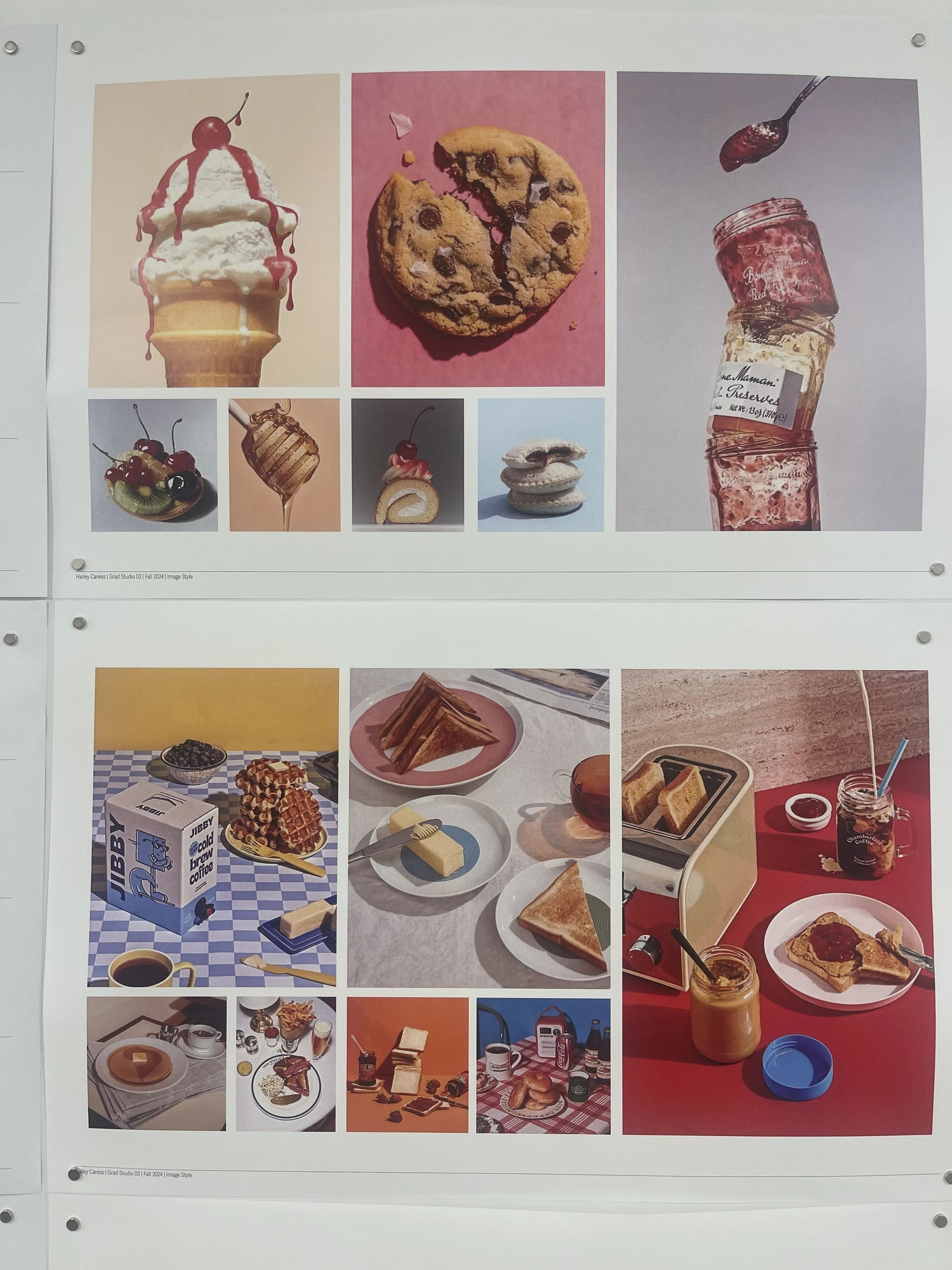
Inspired by American wood type and hyperrealistic food imagery, I explored multiple iterations of brand identities and product applications. Creating packaging prototypes and printing weekly progress helped me hone in on how heritage, could be expressed through typography, color, patterns, and logo treatments.
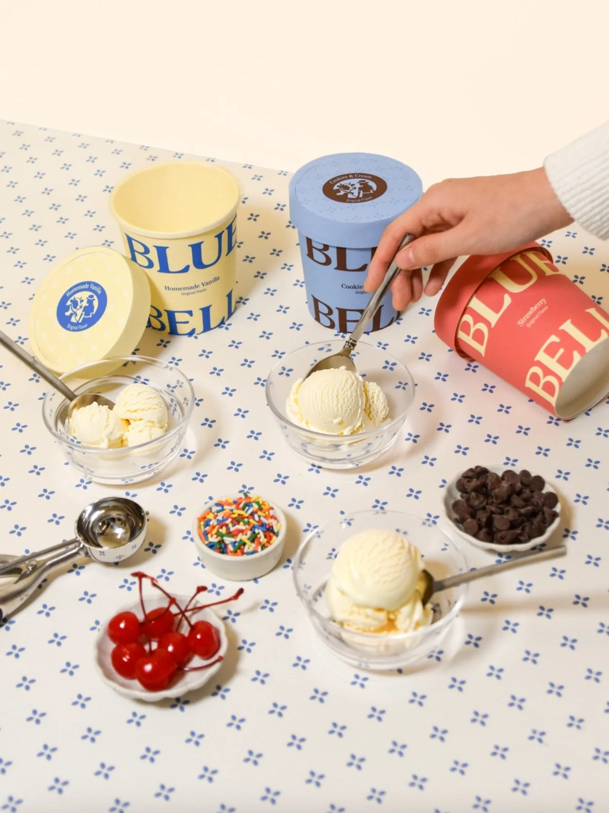
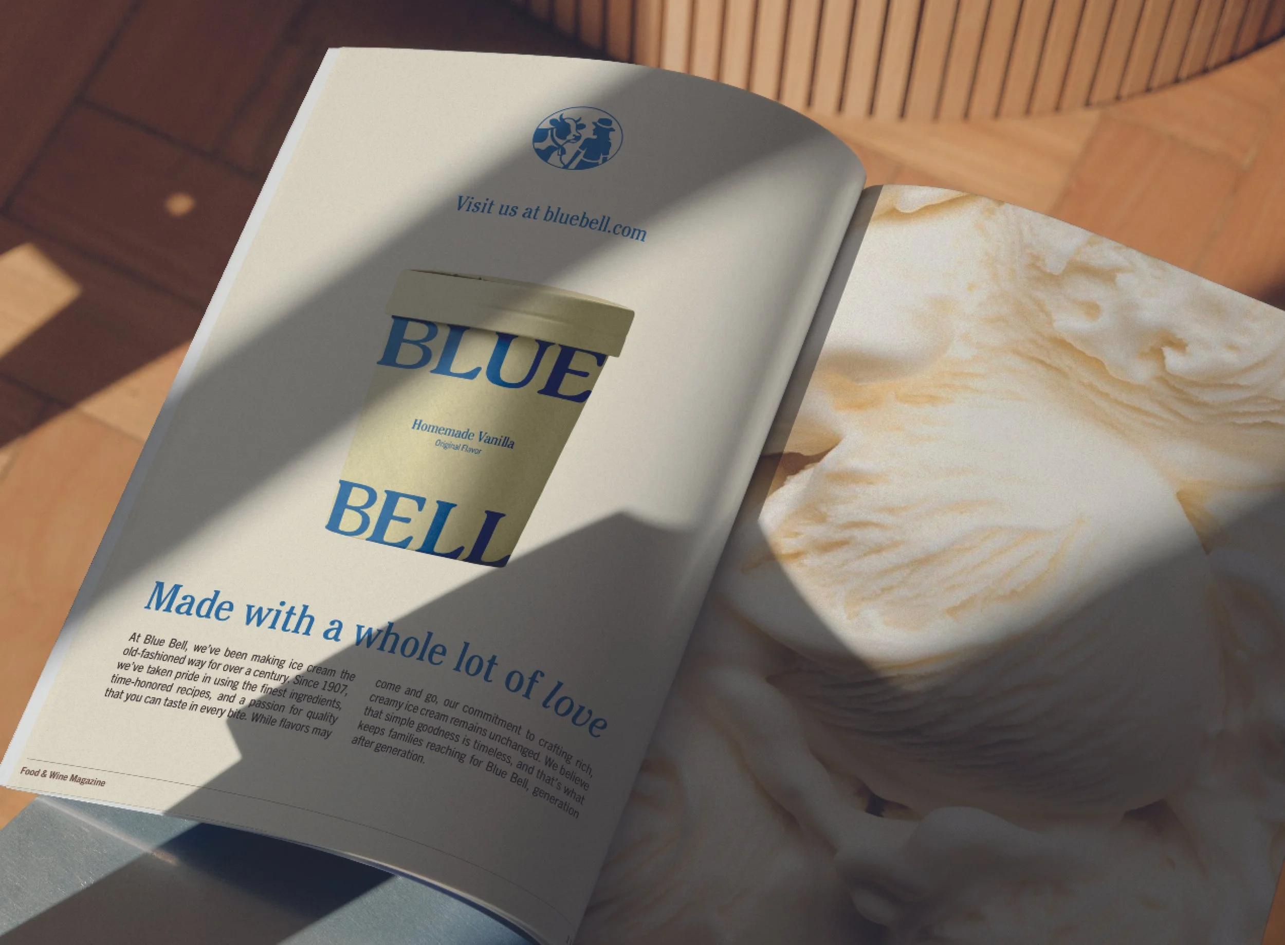
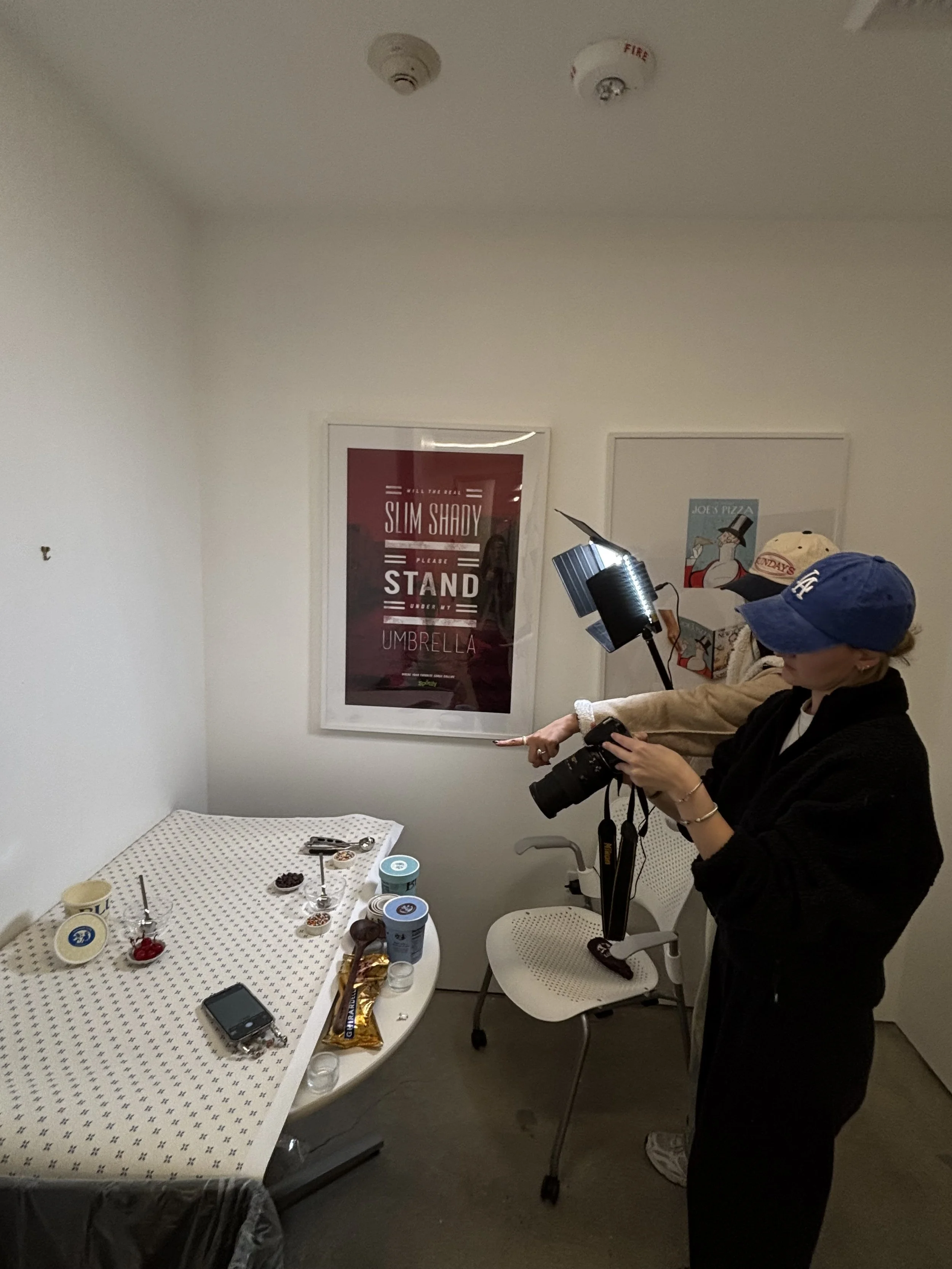
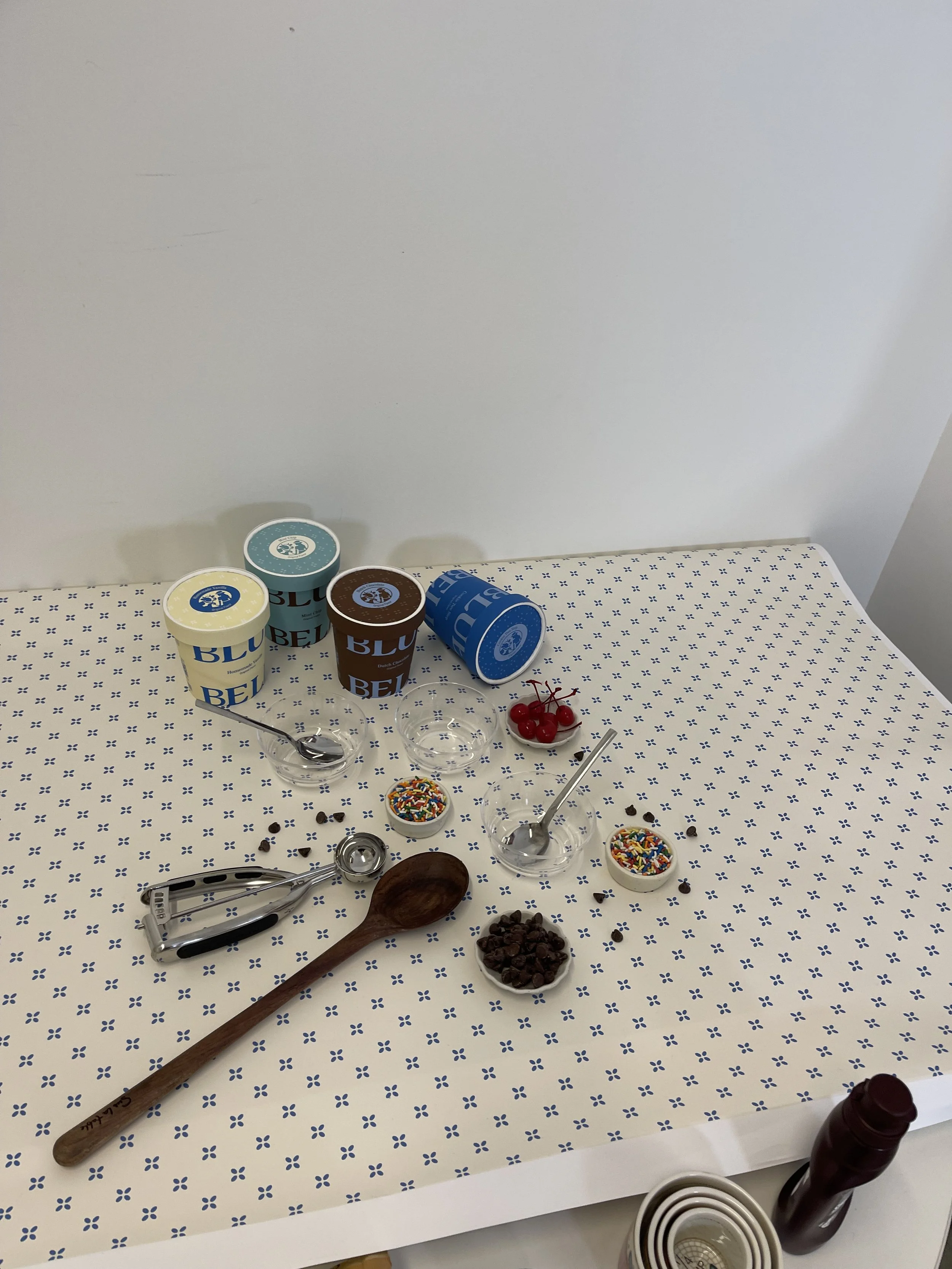
PRODUCT PHOTOGRAPHY
I wanted to capture the essense of messy childhood ice cream parties to bring a sense of familiarity and playfulness to the brand. I used the brand pattern as a seamless backdrop, contrasting the vibrant pints and connecting nostalgic memories with a modern, approachable spirit.
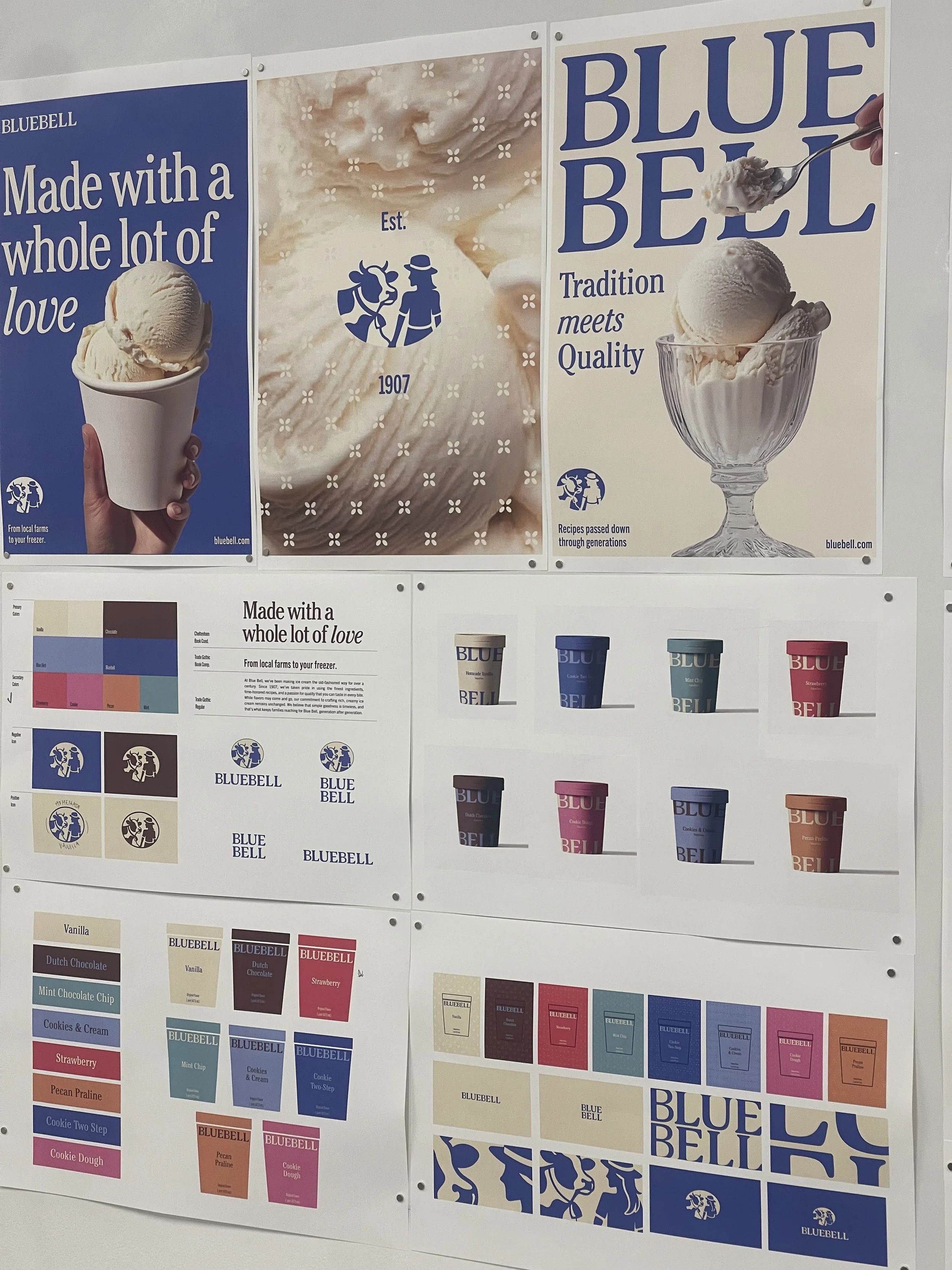
Made with a whole lot of love.