Trader Joe’s
Bath Shoppe
Brand Identity, Art & Creative Direction, Packaging Design & Photography
Trader Joe’s is celebrated for its playful personality, value-driven approach, and loyal customer base, yet its product line had not ventured into self-care. The challenge was to create a bath and body sub-brand that felt authentically Trader Joe’s. I developed a line of bath products that are both functional and full of personality and rooted in nature to seamlessly extend Trader Joe’s world of approachable quality into small everyday luxuries.



CONCEPT STATEMENT
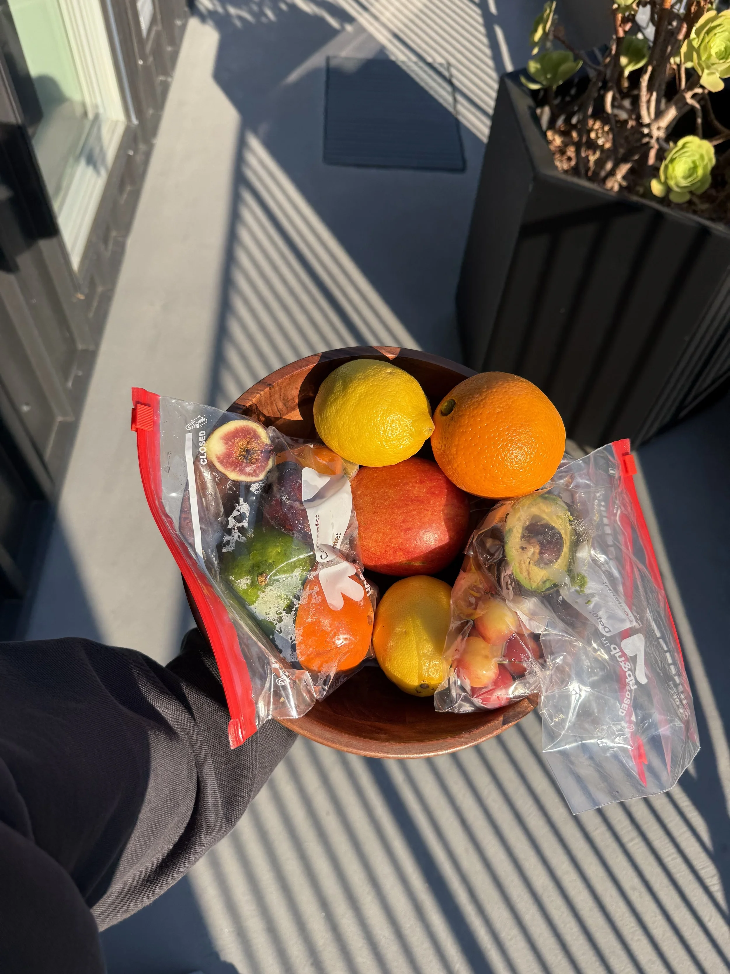
Trader Joe’s Bath Shoppe transforms food waste into natural remedies that nourish your body, with care for your skin and respect for our planet in mind.


TRADER JOE’S INSPIRATION
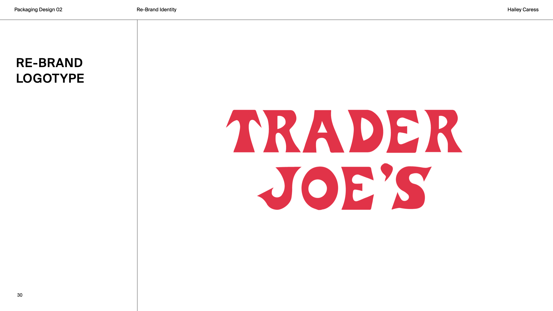
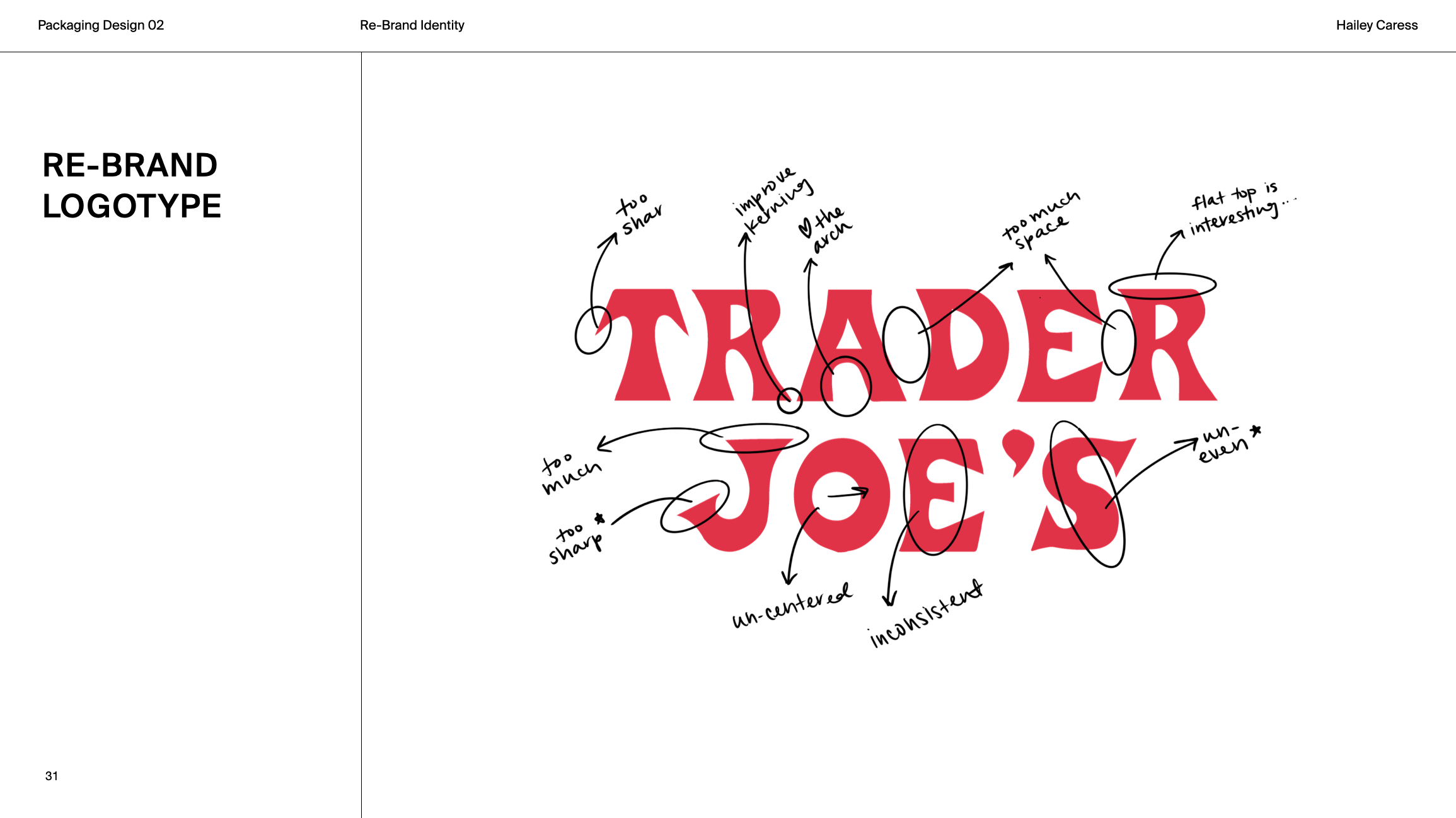
The original mark’s bold imperfections give it personality, but its sharpness and inconsistencies felt dated. Drawing inspiration from Trader Joe’s signature hand-drawn signage, with its charming and approachable character, I reinvented the logotype while preserving the familiar, friendly spirit that makes the brand instantly recognizable.
TRADER JOE’S REBRAND
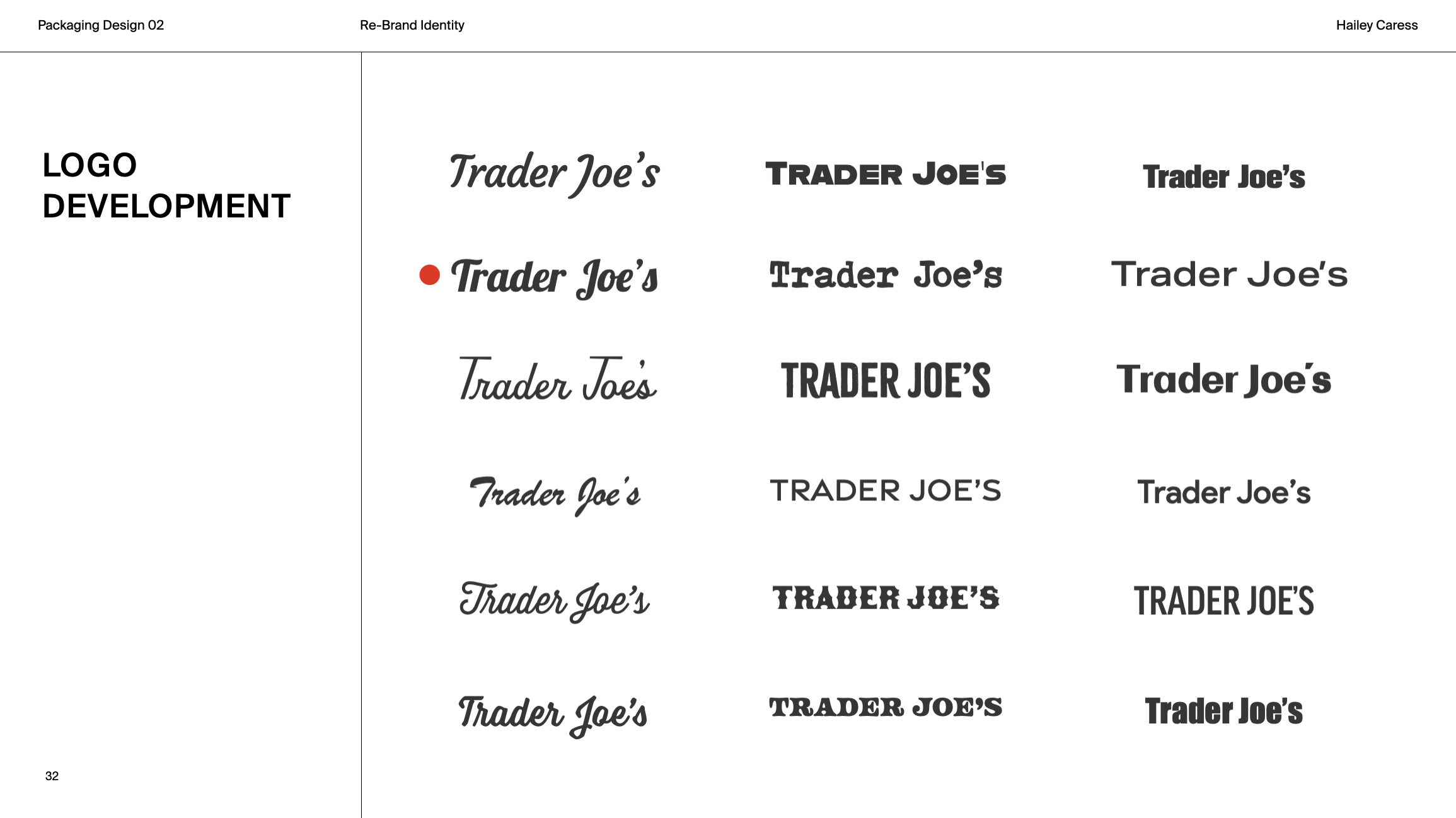
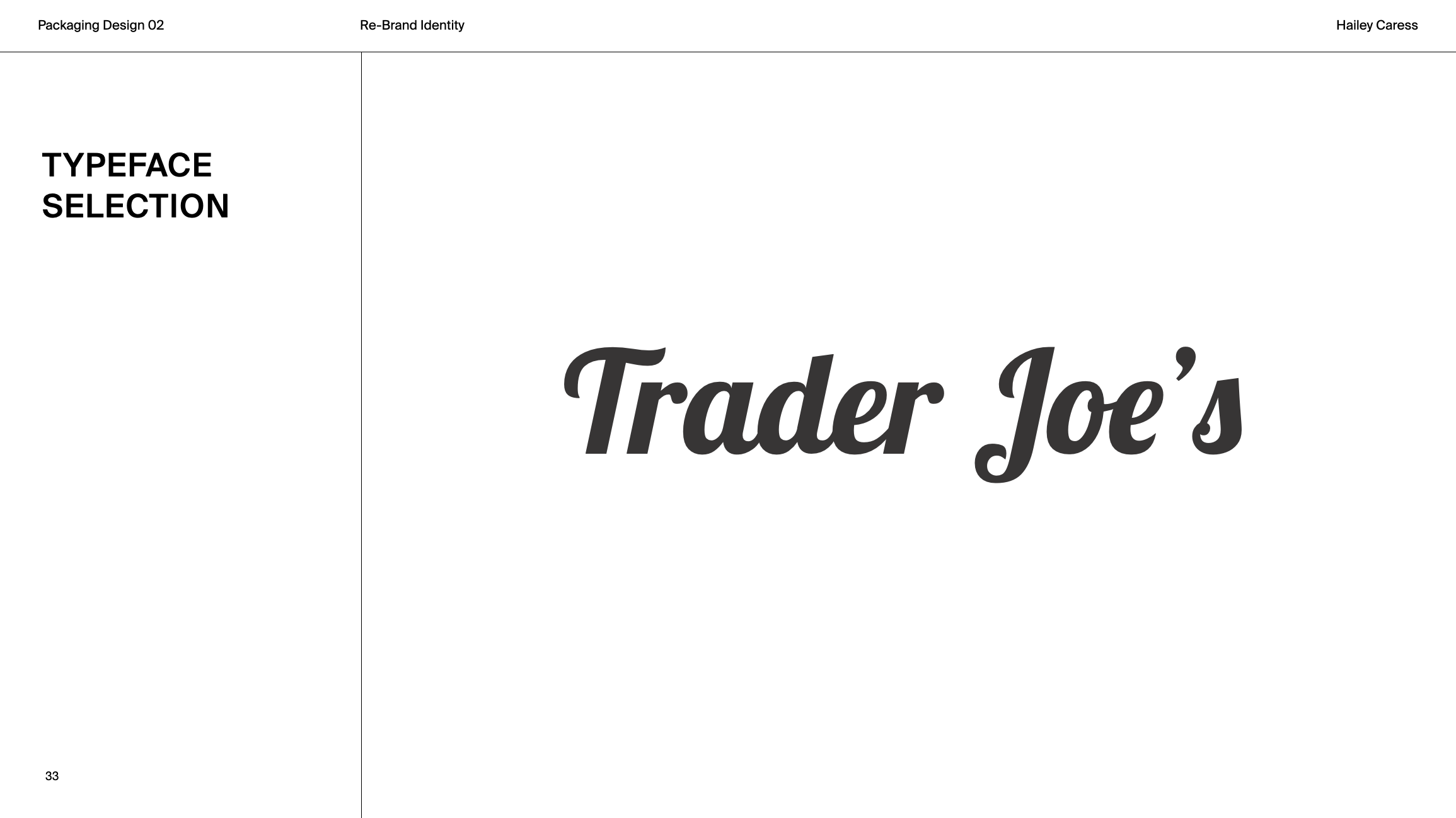
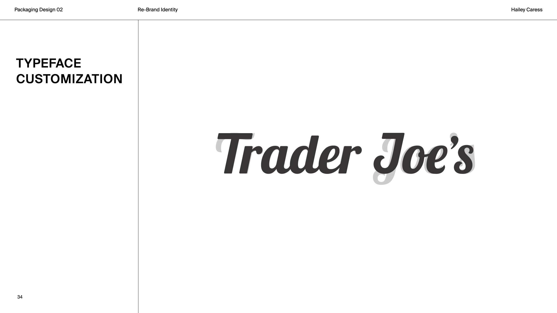
I explored a cursive direction with the Lobster typeface, aimed to capture the warmth and playfulness at the heart of the brand. Subtle refinements to key letterforms and simplified details create a smoother, more cohesive word mark that feels fresh yet unmistakably Trader Joe’s.
TRENDS & OPPORTUNITIES
Nearly 30–40% of the U.S. food supply goes to waste each year due to imperfections or short shelf life. In response, the beauty and wellness industry is embracing upcycled ingredients, ancient rituals, and sustainable self-care, reflecting a shift toward holistic wellness and eco-conscious living.
TARGET AUDIENCE
The target audience values self-care that feels intentional, approachable, and thoughtfully designed without being overpriced. Often frustrated by clinical or overly complicated products, they gravitate toward options that are accessible and beautiful.
BATH SHOPPE CONCEPT
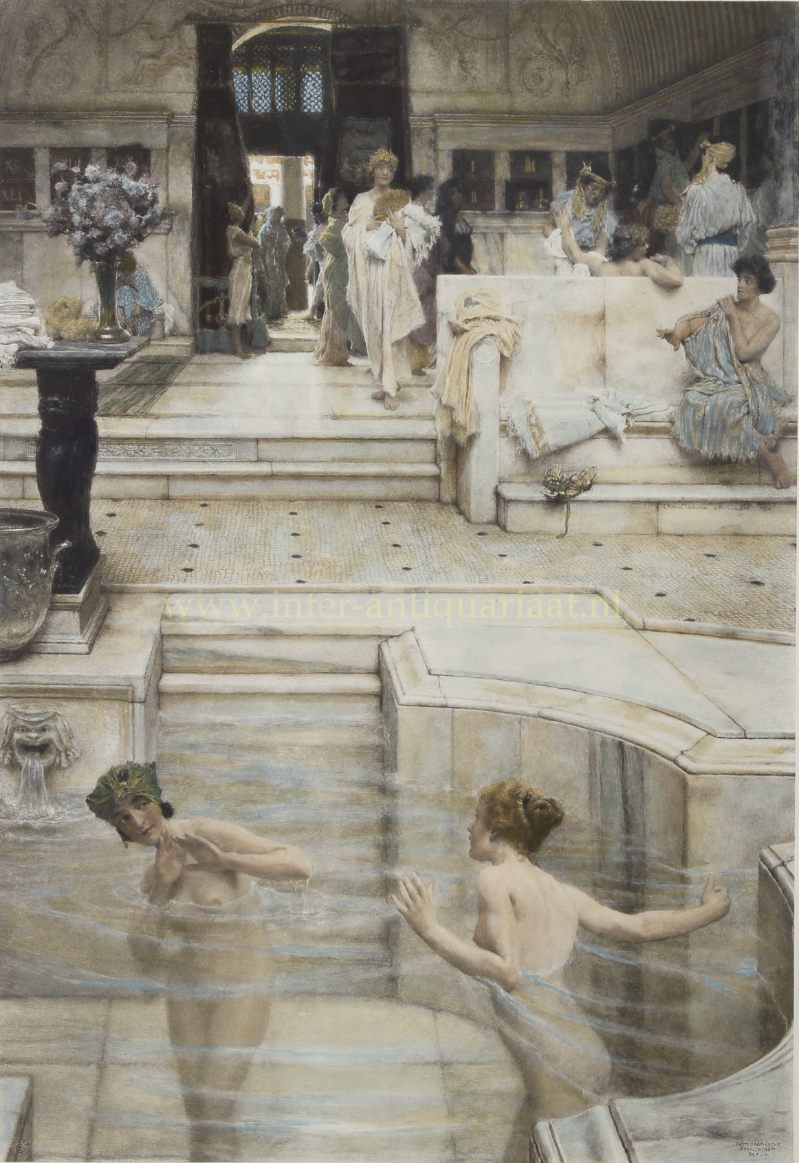
For the Bath Shoppe identity, I drew inspiration from ancient European and Roman communal baths, sculptural forms, and classical still-life paintings, reinterpreted through a contemporary lens that aligns with Trader Joe’s aesthetic.
BATH SHOPPE IDENTITY
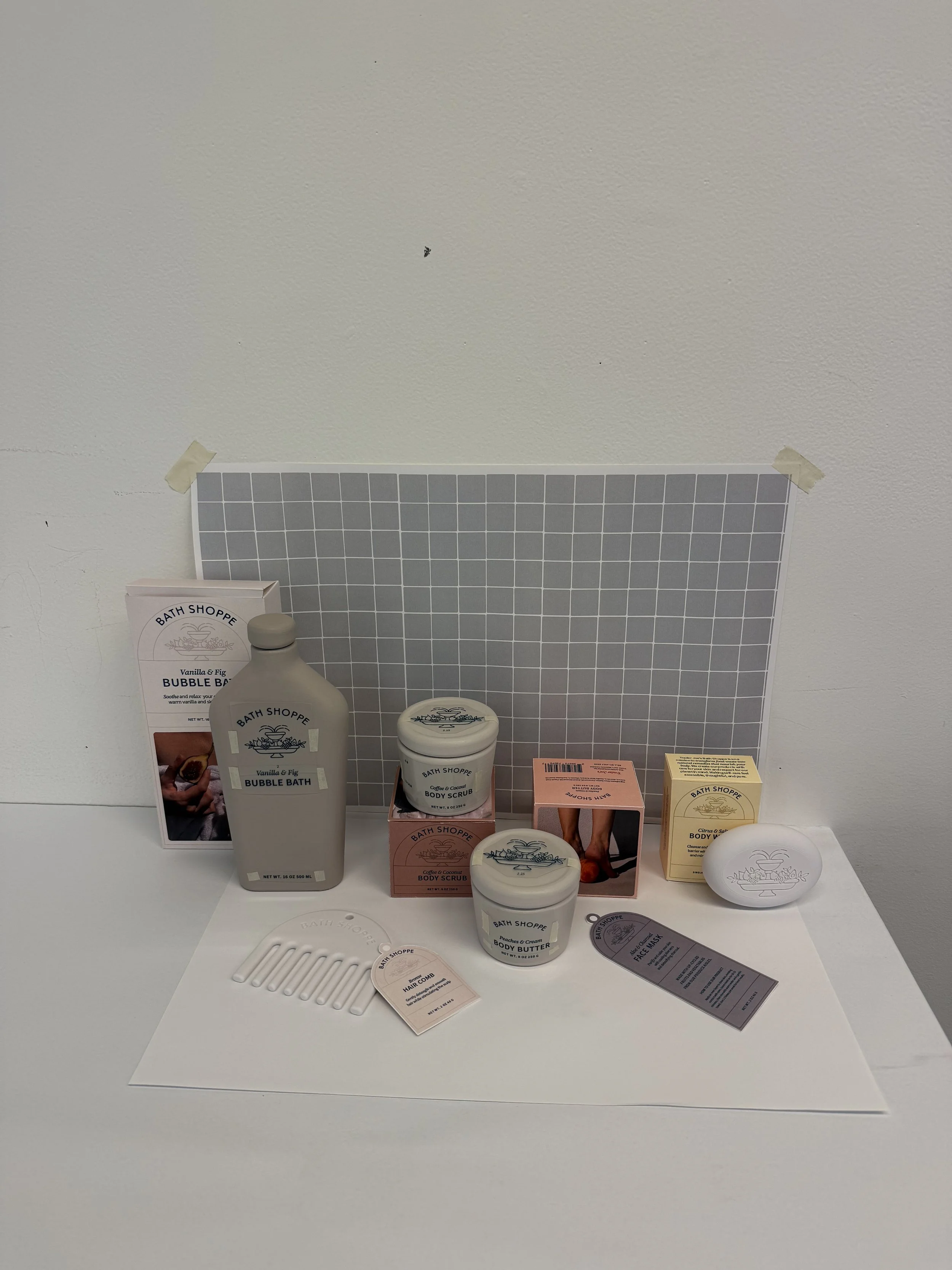
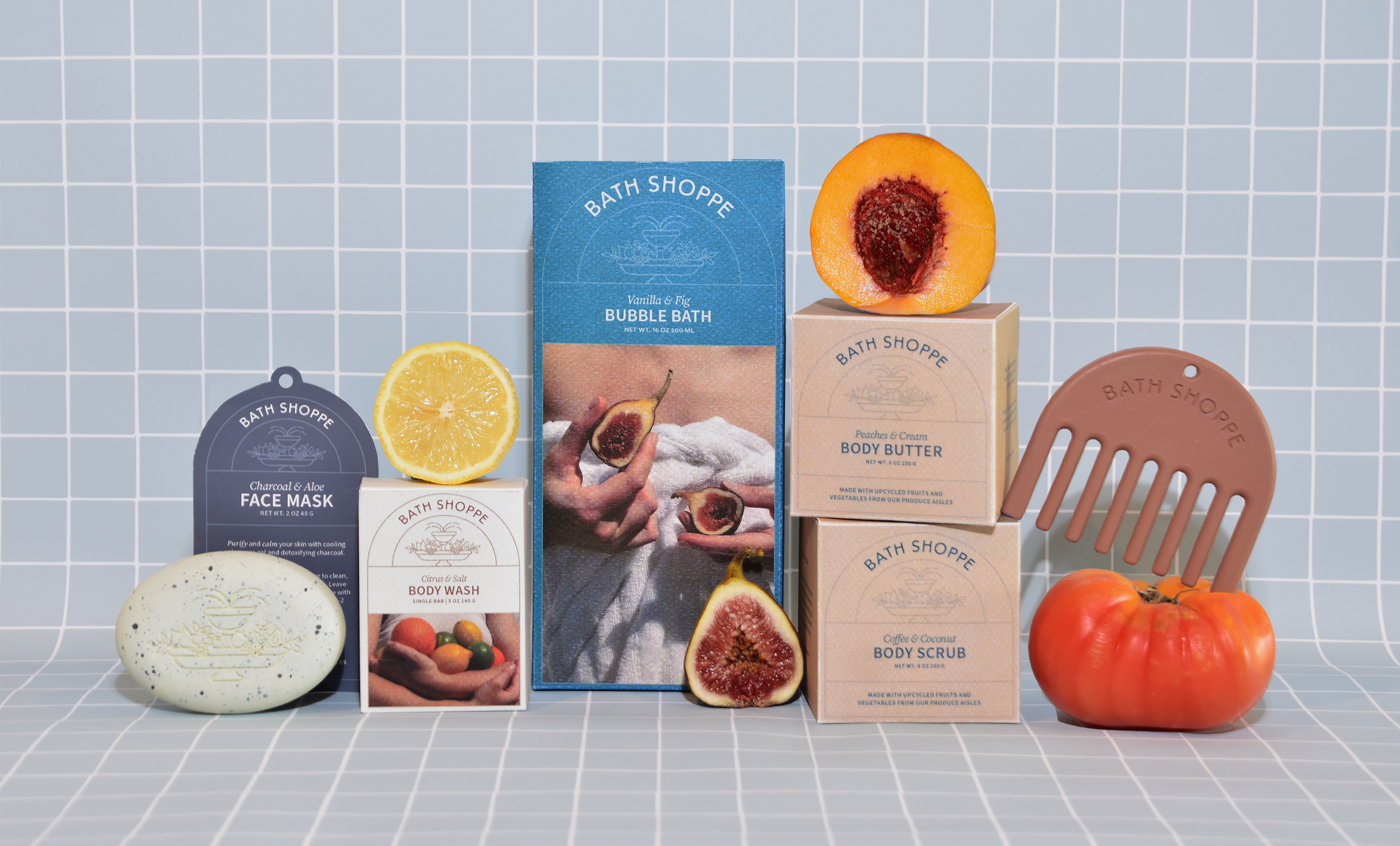
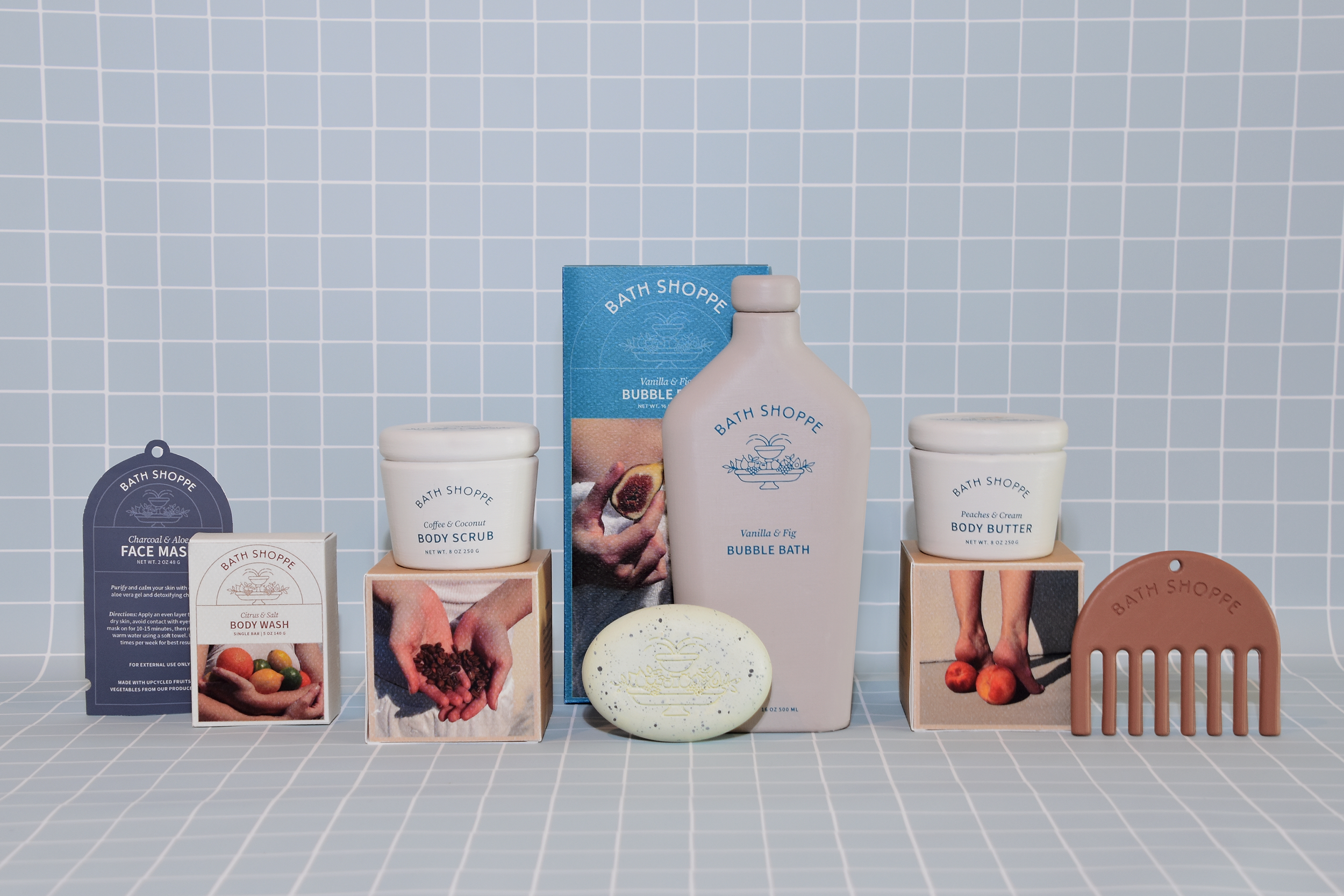
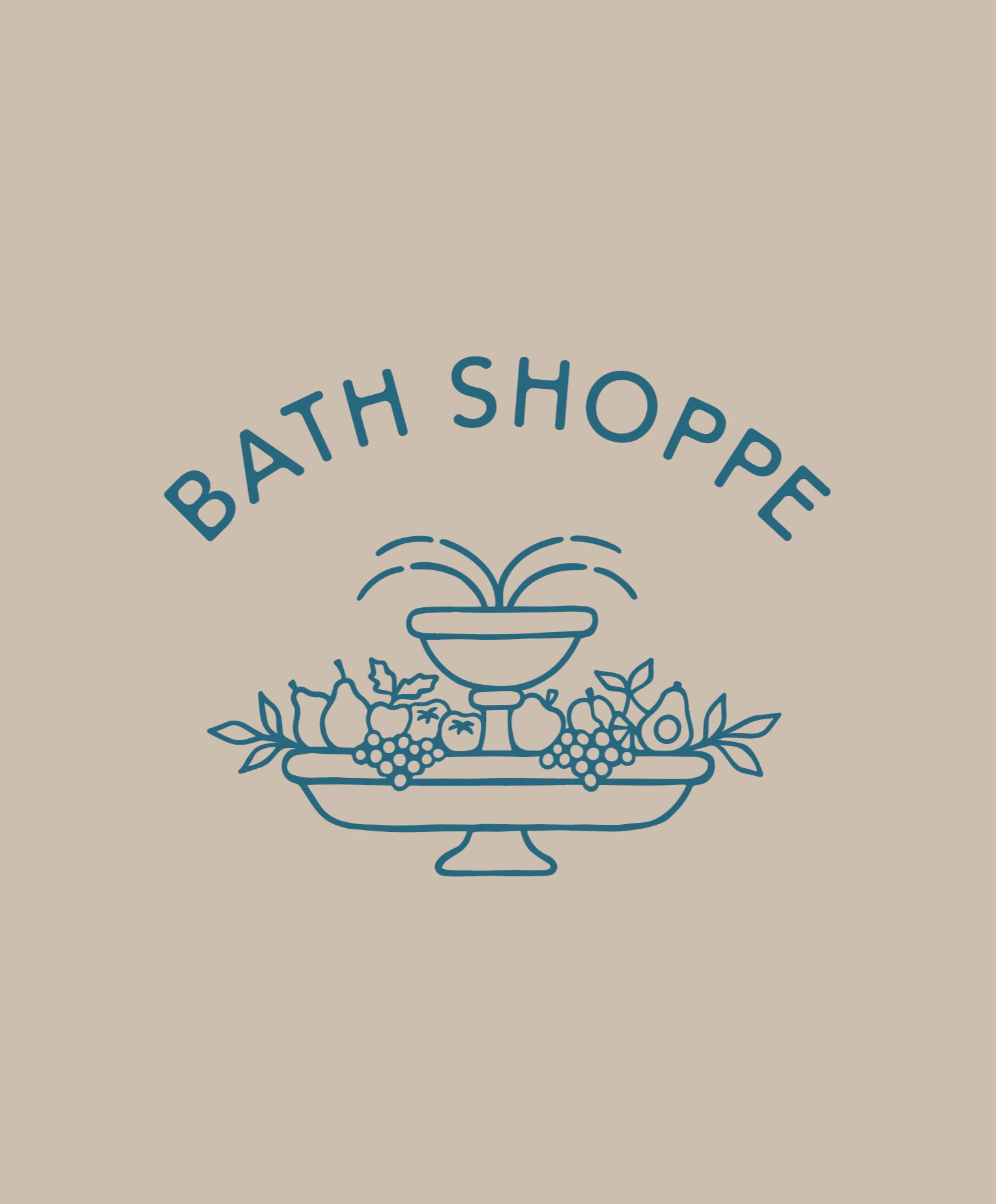
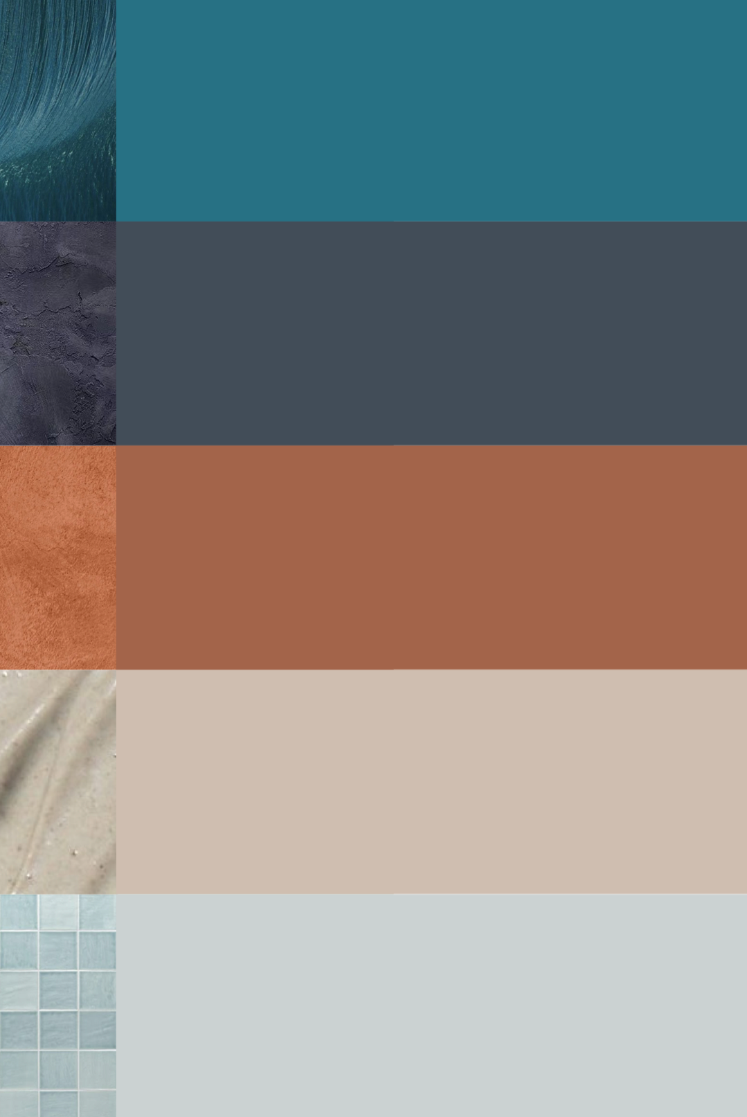
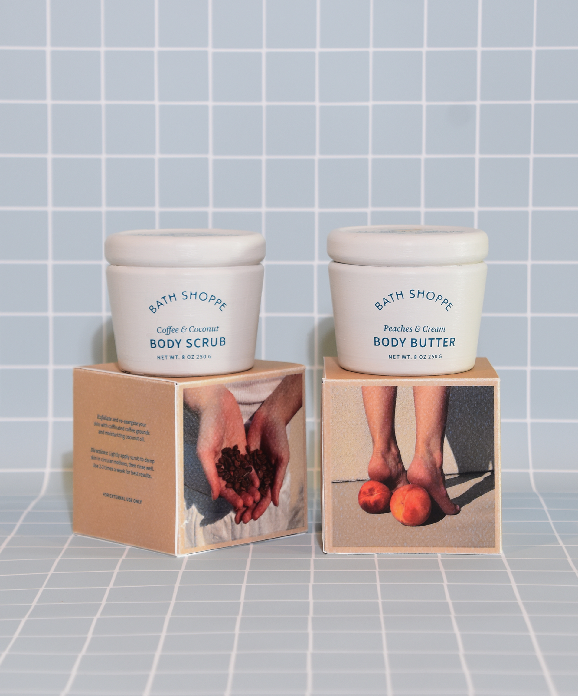
The arched logotype is fluid, echoing the architecture of Roman baths. A fruit fountain illustration references Trader Joe’s circular logo while highlighting the product’s produce-based ingredients. The natural color palette, anchored by earth’s materials, evoke authenticity, freshness, and a sense of everyday luxury.





FREQUENT FLYER
I designed a large-format Frequent Flyer newspaper to announce the launch of the Bath Shoppe sub-brand to the Trader Joe’s audience. It features insightful articles on preventing food waste and highlighting ingredient benefits, reflecting the brand’s focus on thoughtful living while giving a fresh take on a traditional Trader Joe’s touchpoint.
PHOTOGRAPHY
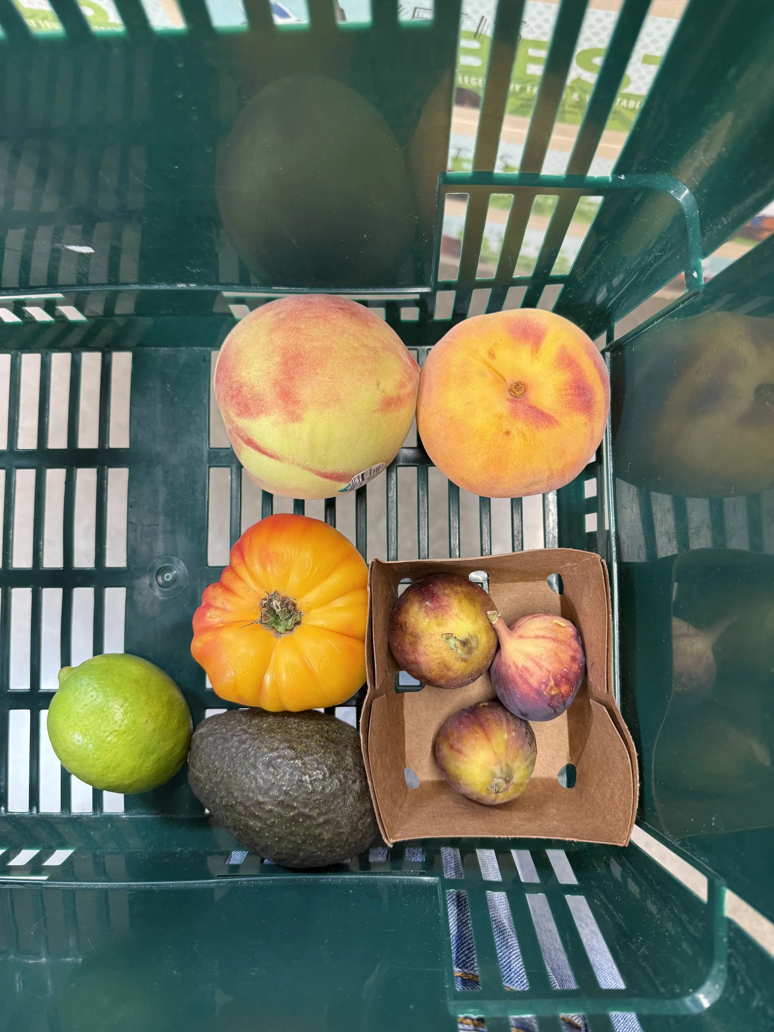
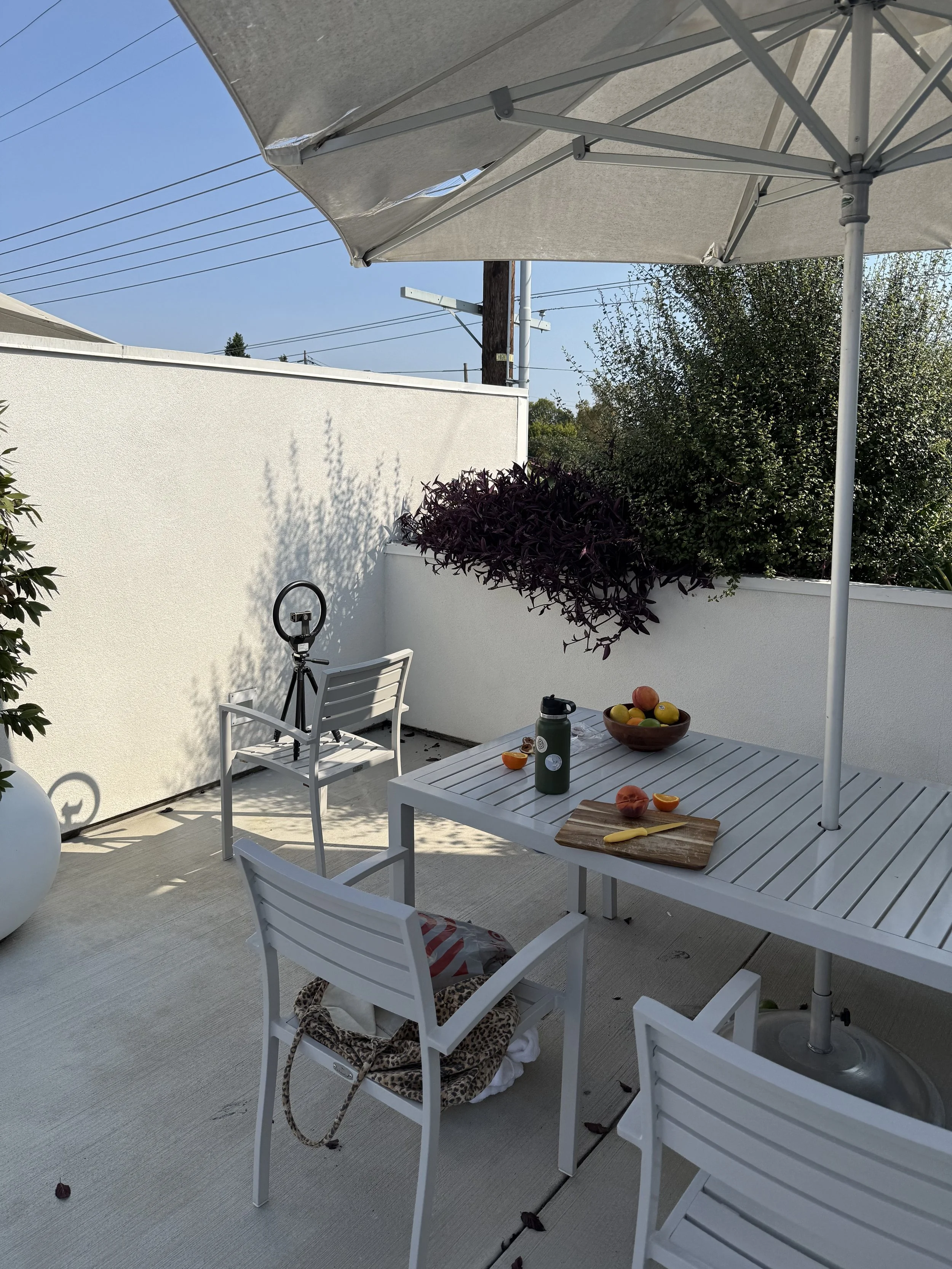
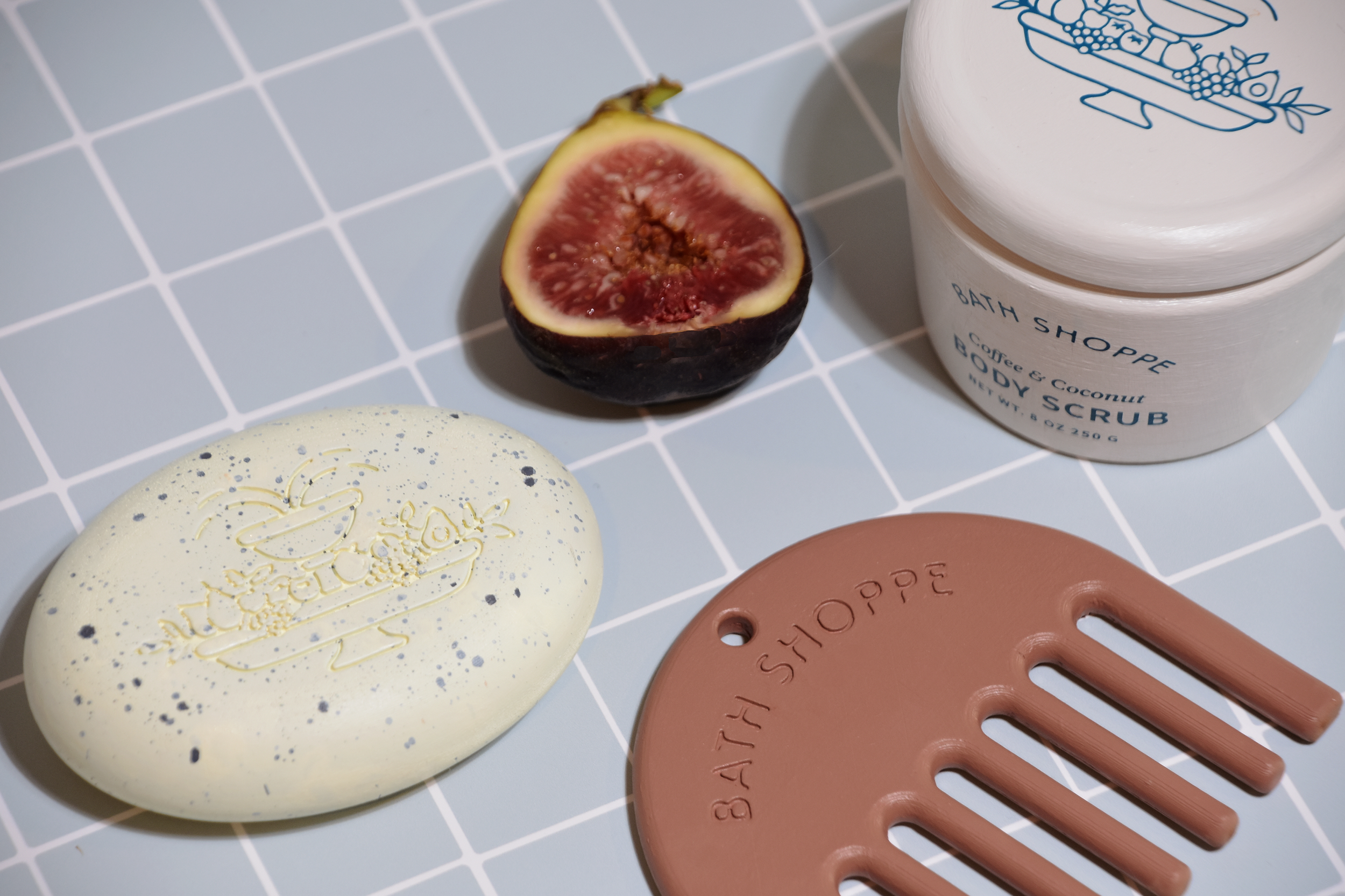
The photography captures the abundant, vibrant nature of the brand. Lifestyle shots emphasize physical interaction with fresh fruits, highlighting the sensory connection between the products and their ingredients. While product photography is bright and carefully composed, drawing inspiration from European still-life paintings.
PROCESS
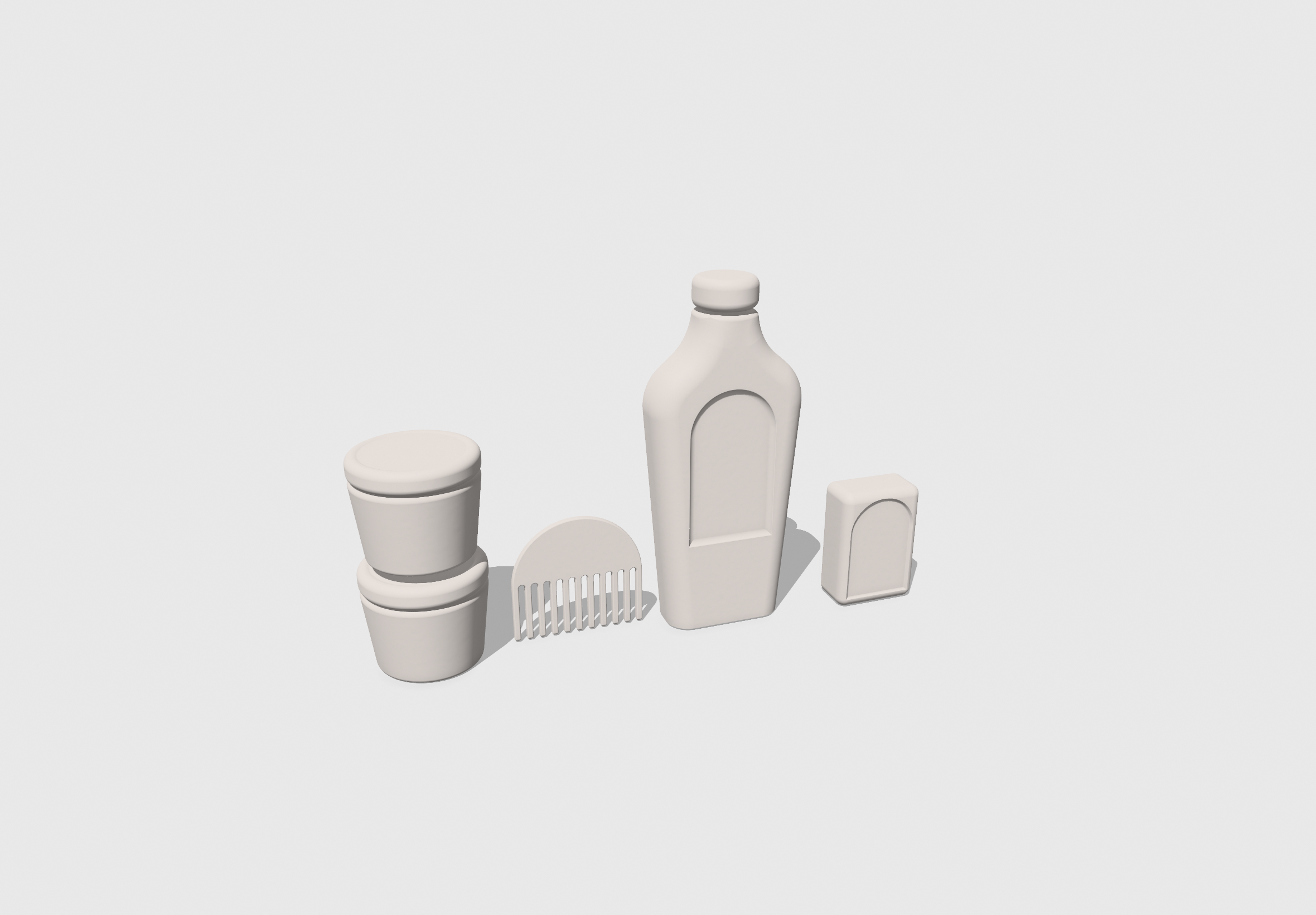
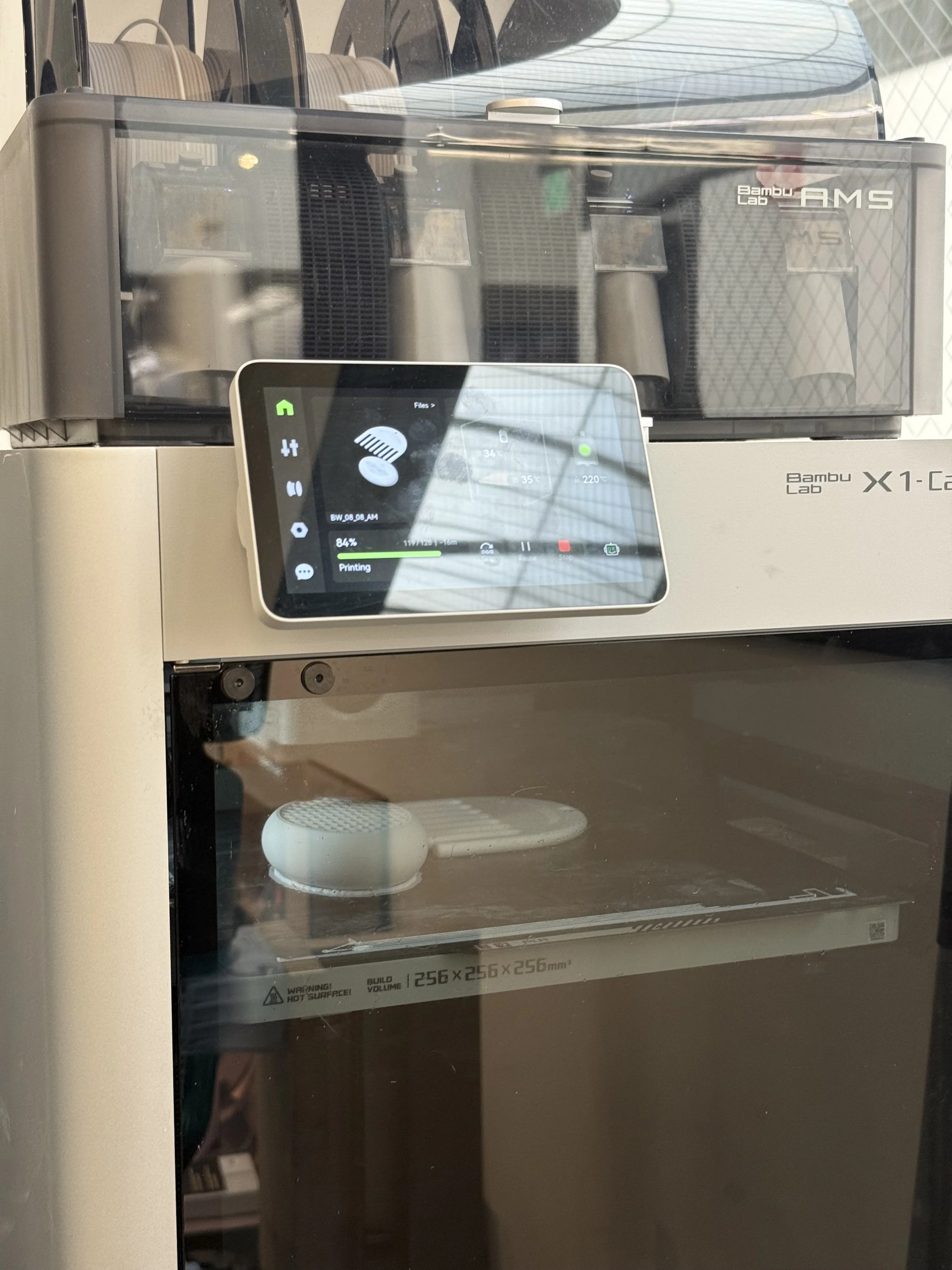
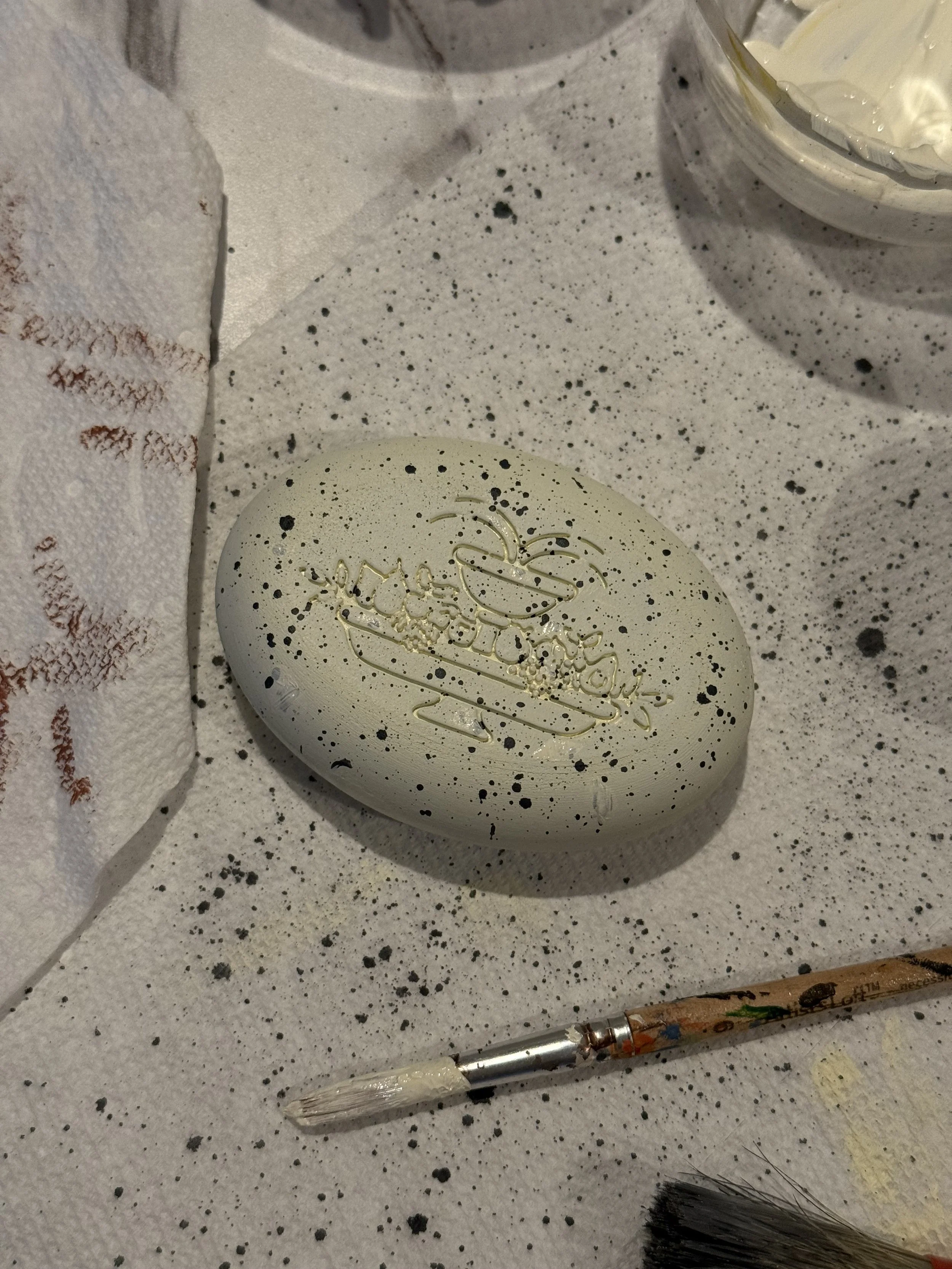
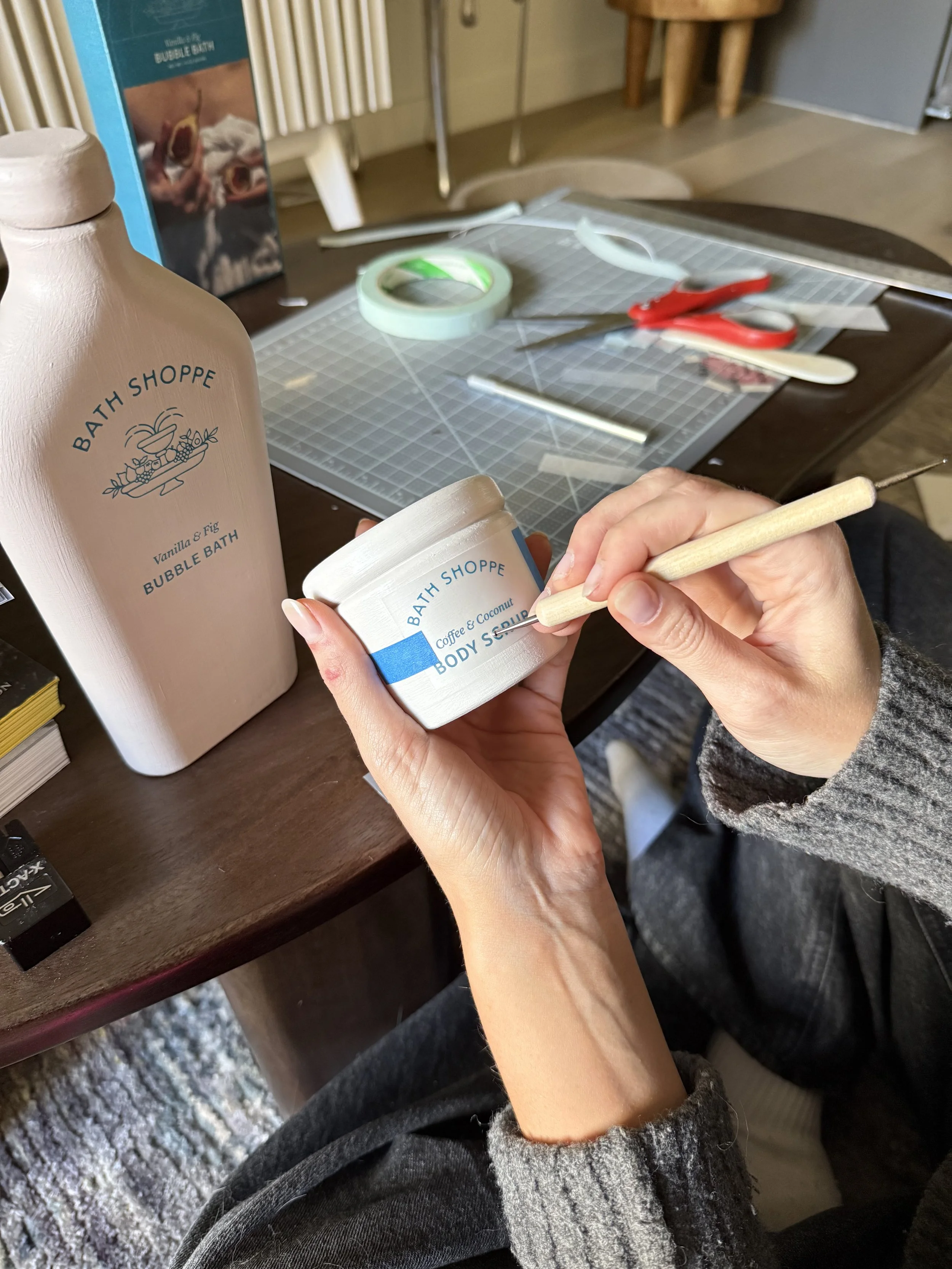
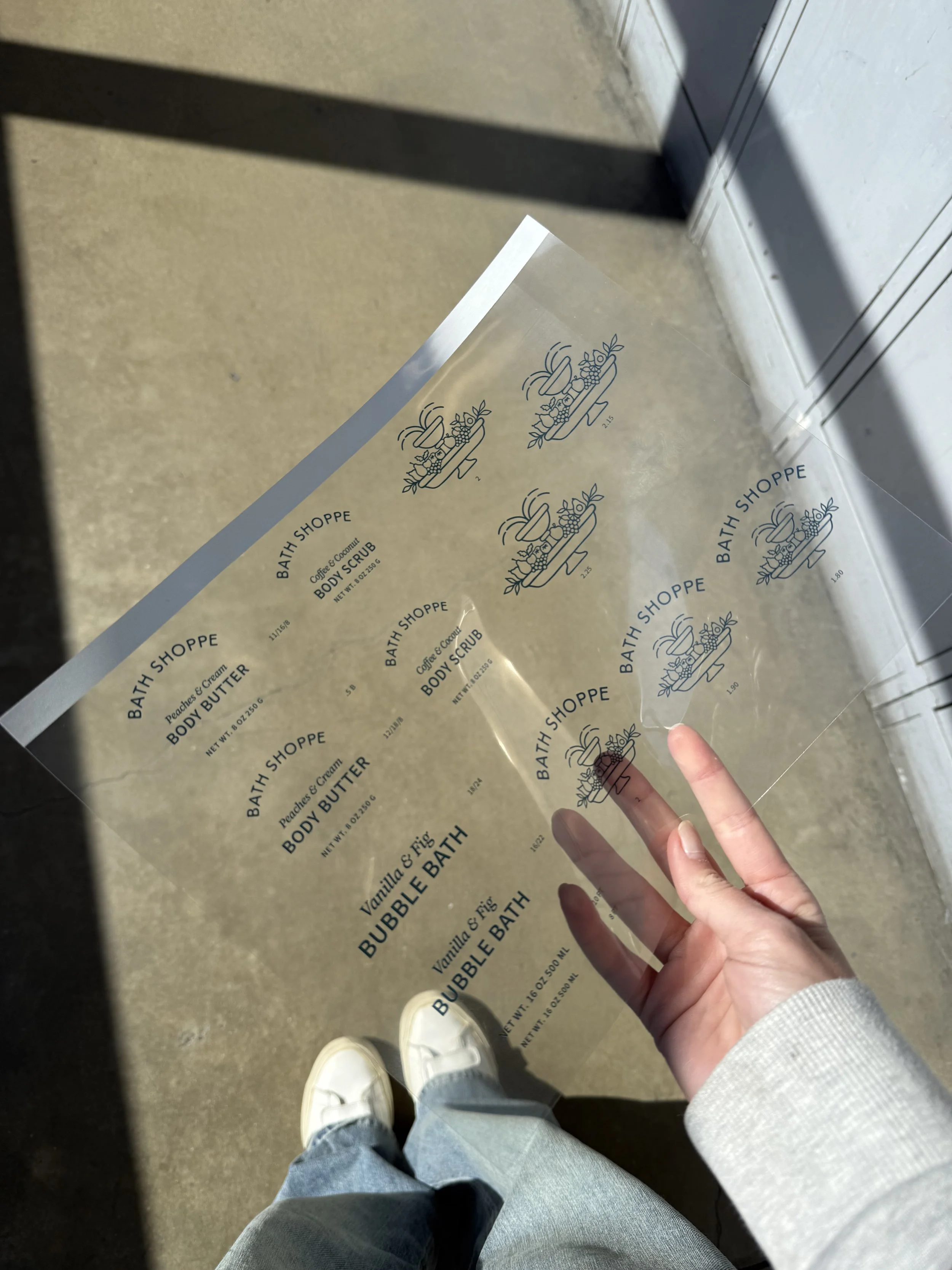
I began by sketching ceramic vessel shapes with tapered bases and soft, rounded corners, then brought the forms to life using 3D printing. Each piece was primed, sanded, and hand-painted to achieve the desired colors and textures. I explored staging, logo placement, and type size using clear vinyl, and experimented with chromatic transfers to ensure the forms were visually sophisticated.
PROPOSED MATERIAL
The primary packaging is made from post-consumer recycled plastics with a matte finish, selected for recyclability, availability, and cost-effectiveness. Secondary packaging is crafted from natural linen paper, providing a tactile, handcrafted feel, with silk-screened spot PMS colors printed directly onto the packaging to create a high-end, elevated look.
